Brand Guidelines
Consider this our one-stop-shop for all things HyperGrounded. This guide defines the copy, principles, and design language we walk by.
At our core, HyperGrounded exists to help people live in integrating ways with tech as one tool in their tool belts. Whether we’re designing for digital platforms or printed materials, these guidelines ensure every touchpoint reflects the core of HyperGrounded.
Contents
01 Brand Strategy
Our Vision
To design technology that amplifies humanity’s relational, emotional, and creative strengths such that authentic relationships, meaningful experiences, and holistic well-being flourish across the personal and professional sphere.
Our Mission
Our mission is to amplify humanity's story over the cacophony of the modern world by creating space to explore authentic thought and writing; augmented, not amputated, by AI tools.
Our Values
Our Messaging
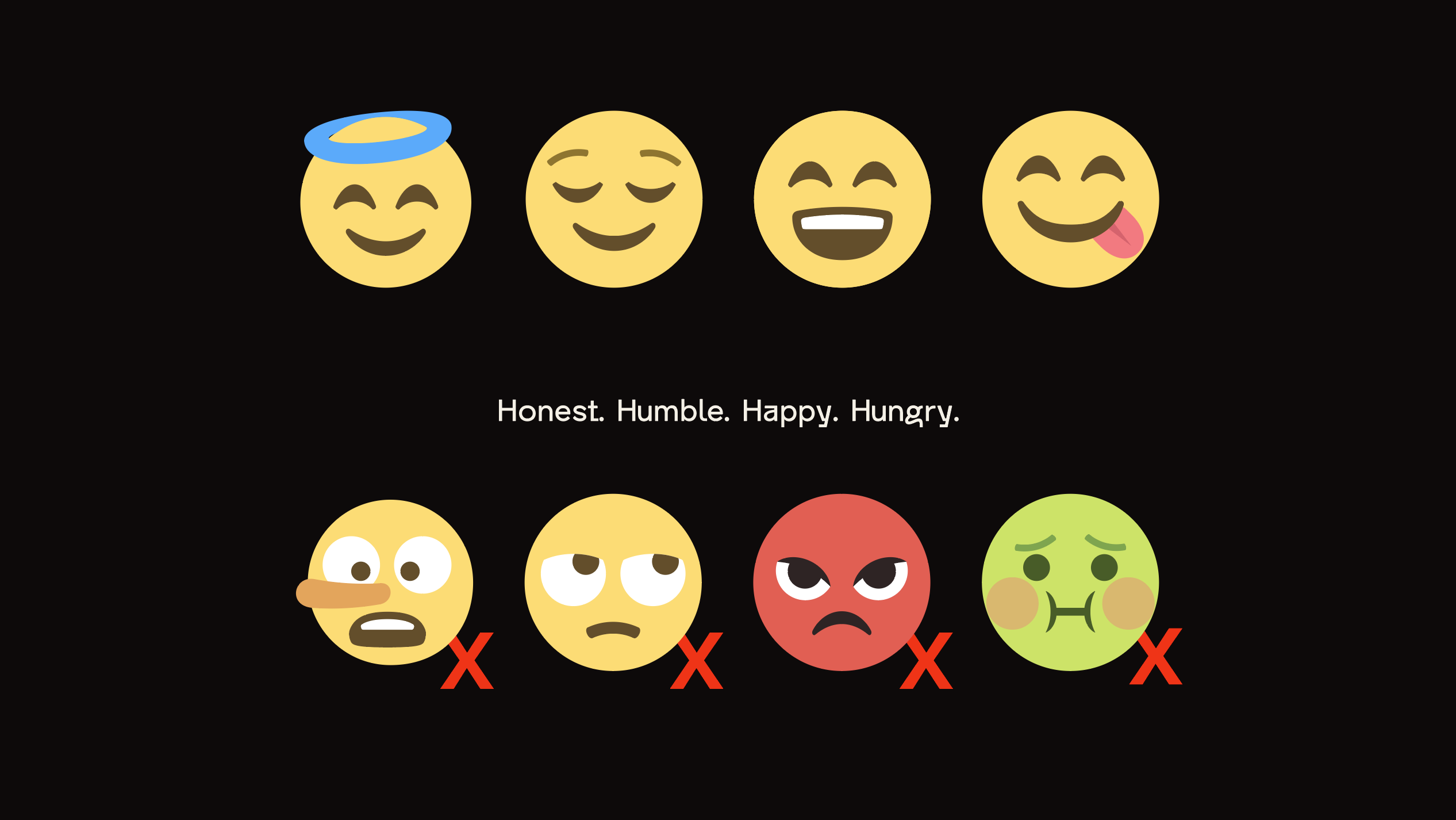
Voice
No fluff, we’re all human here. We are realistic. We enjoy life and the work we get to do. We encourage fun, quirk, and unconventionality.
Tone
Light, playful, somewhat informal, relatable, energetic, clear, considerate, intentional, and helpful.
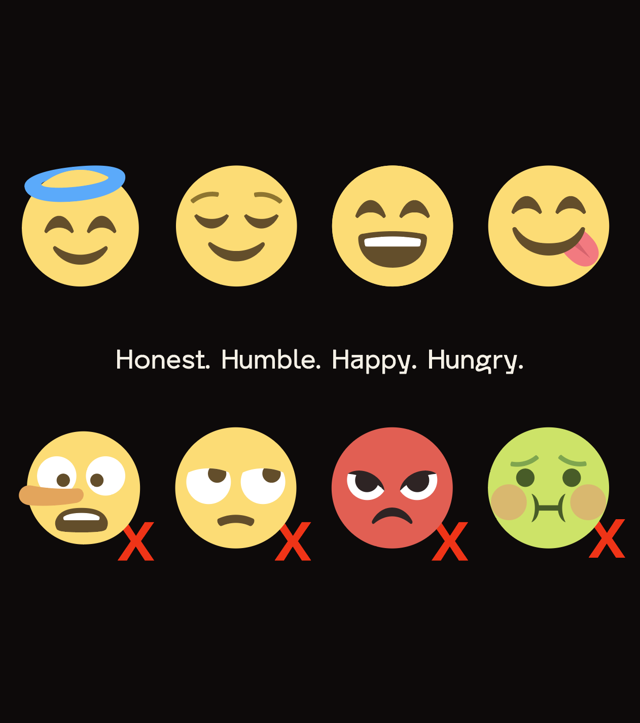
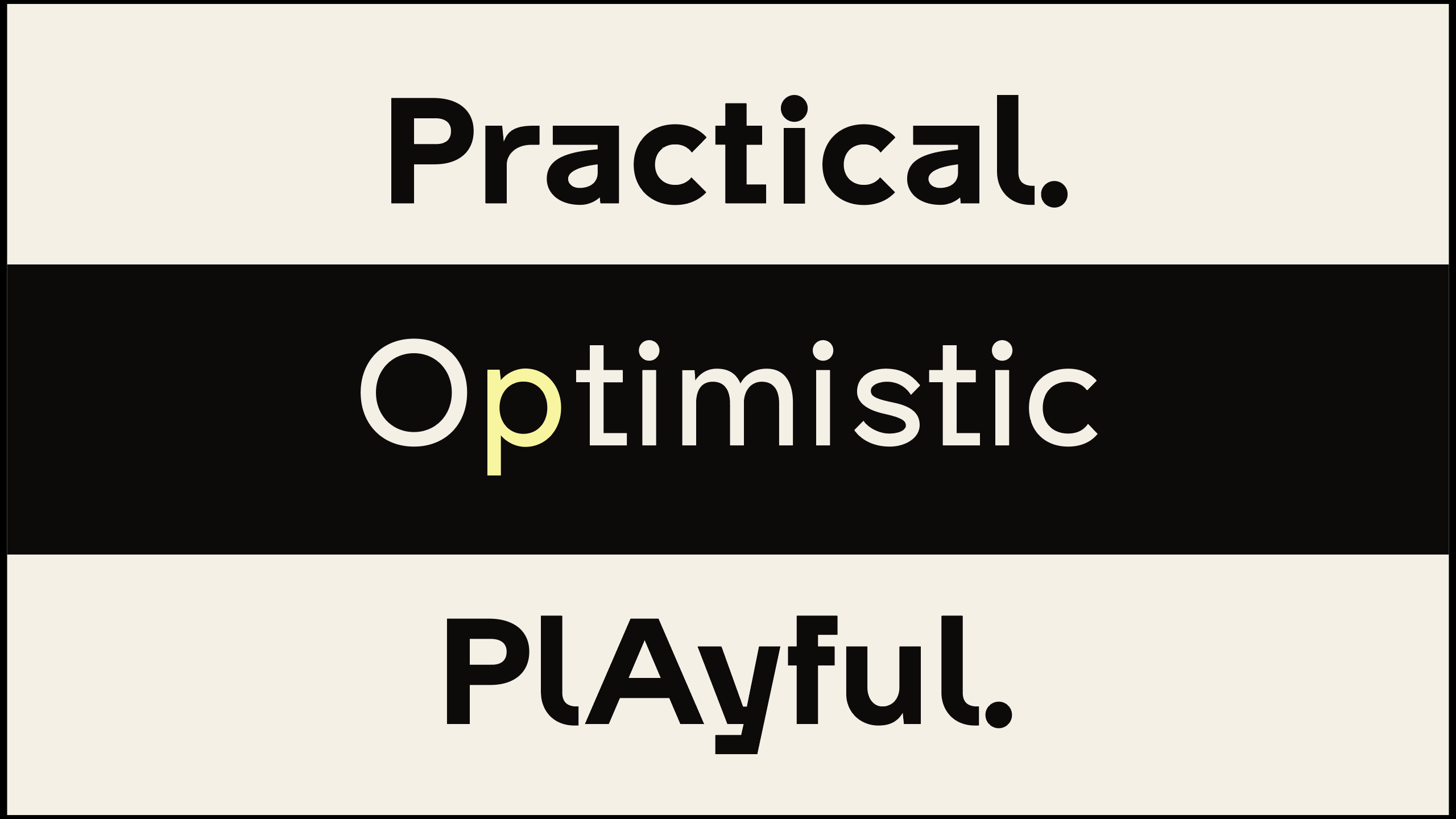
Our Personality
Sample Copy
Why It Matters
Writing is the currency of credibility. Too little polish, and you come across as sloppy, whereas too much, and you blend into the background.
HyperGrounded Launches JRNLI: A Writing Assistant That Writes With You, Not For You
Today, HyperGrounded, a company on a mission to amplify humanity’s creative strengths, announced the launch of JRNLI.
Join Our Reddit
Welcome to our community! This is the place for explorers, tinkerers, and everyday folks using JRNLI (jrnli.ai) to get more out of AI without the headache.
Meet JRNLI!
JRNLI (jern-lee) is your tireless AI thought partner. Born from a scrappy side project that cured our blank-page blues, it helps you think faster, deeper, and more authentically. Early access open now; we'd love your feedback!
02 Audience
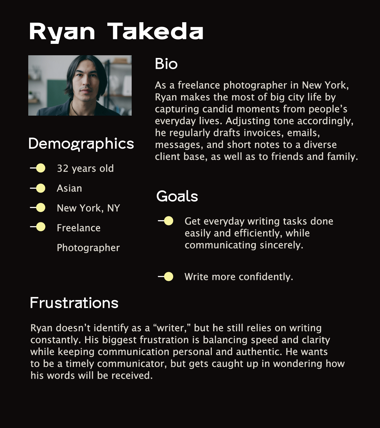
Our audience is pretty darn cool. One thing they all have in common is their routine need to communicate to diverse audiences through clear, concise, and compelling writing.
Personas like the ones below, give us a better understanding of who we are designing for and why it matters.
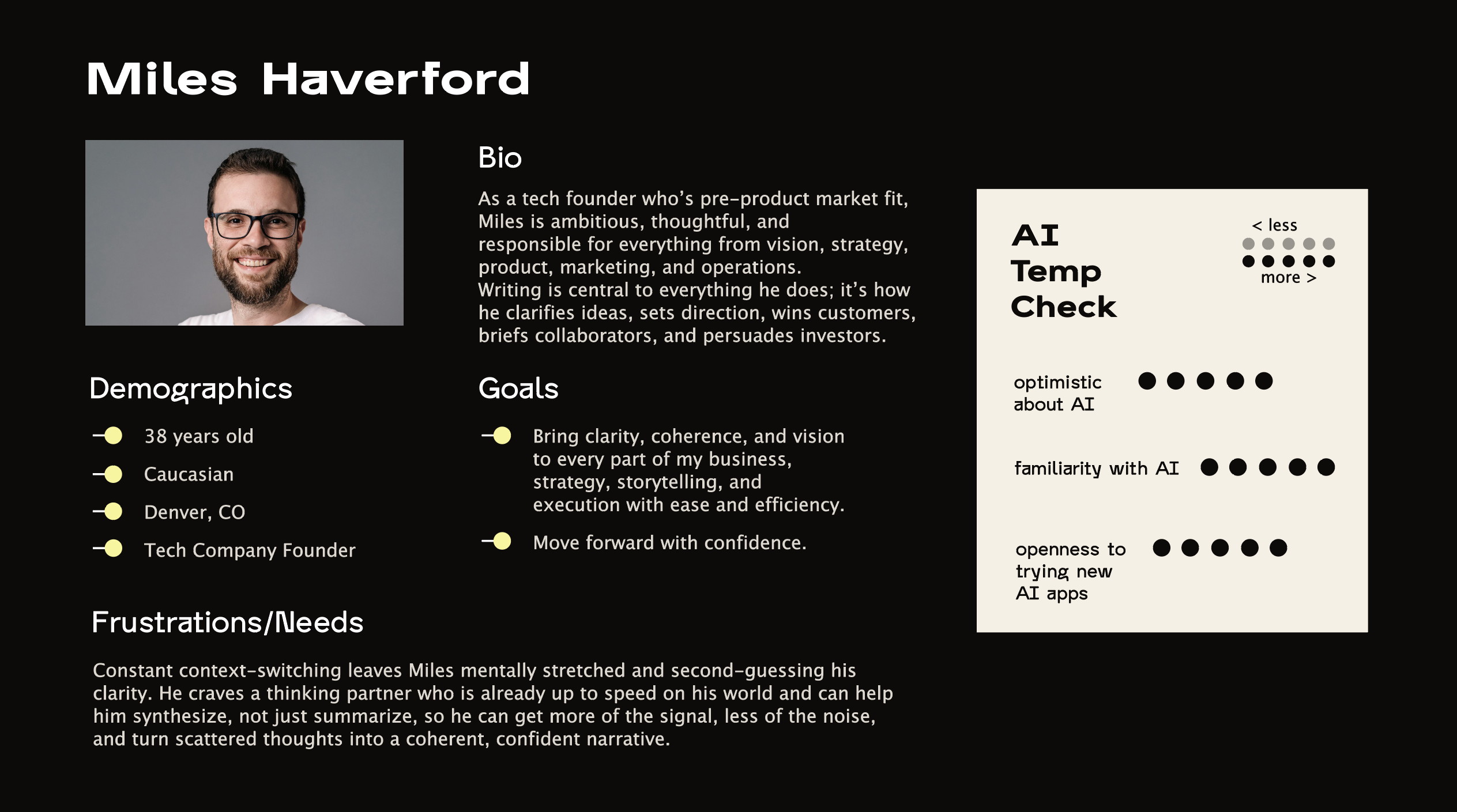
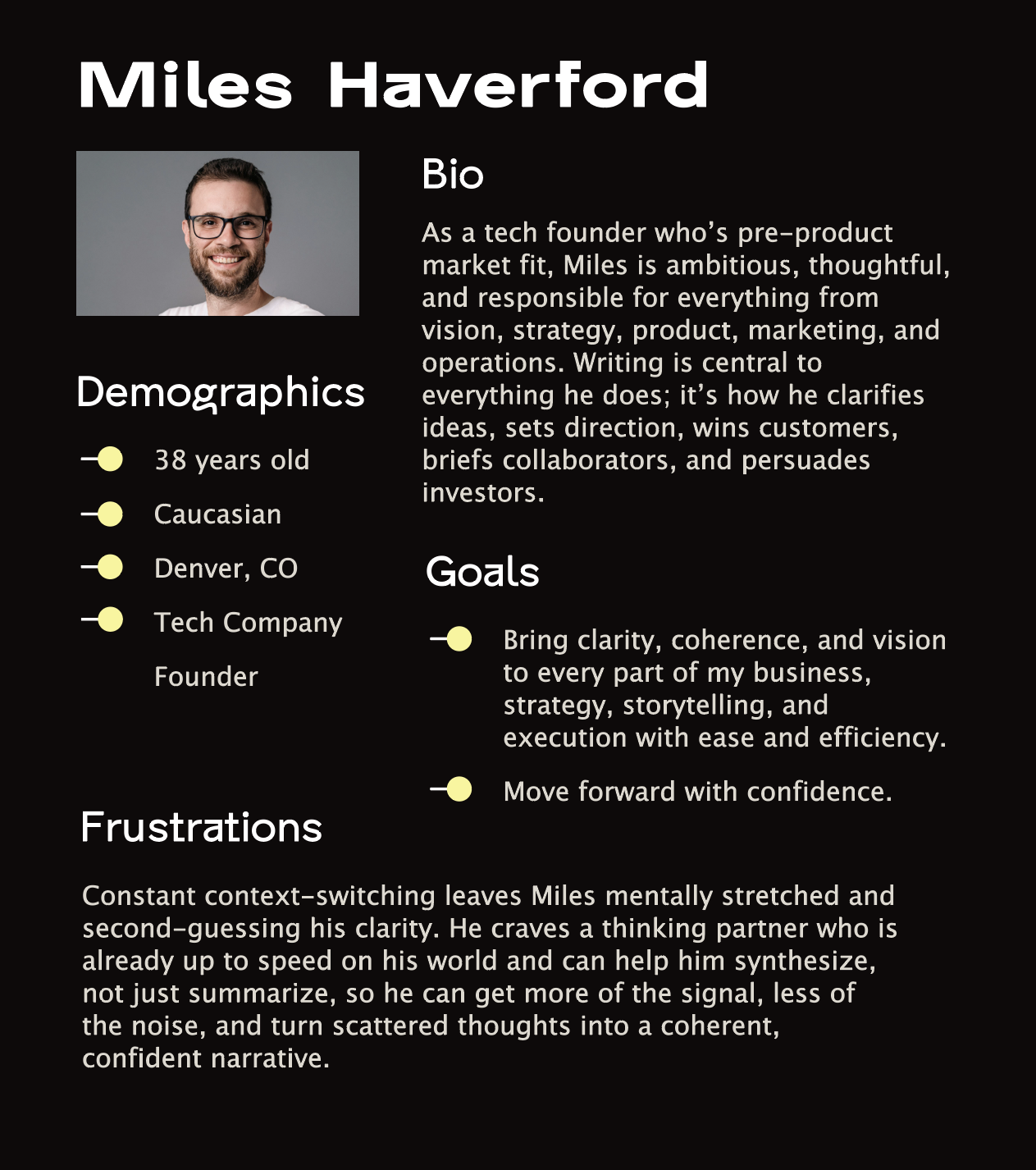
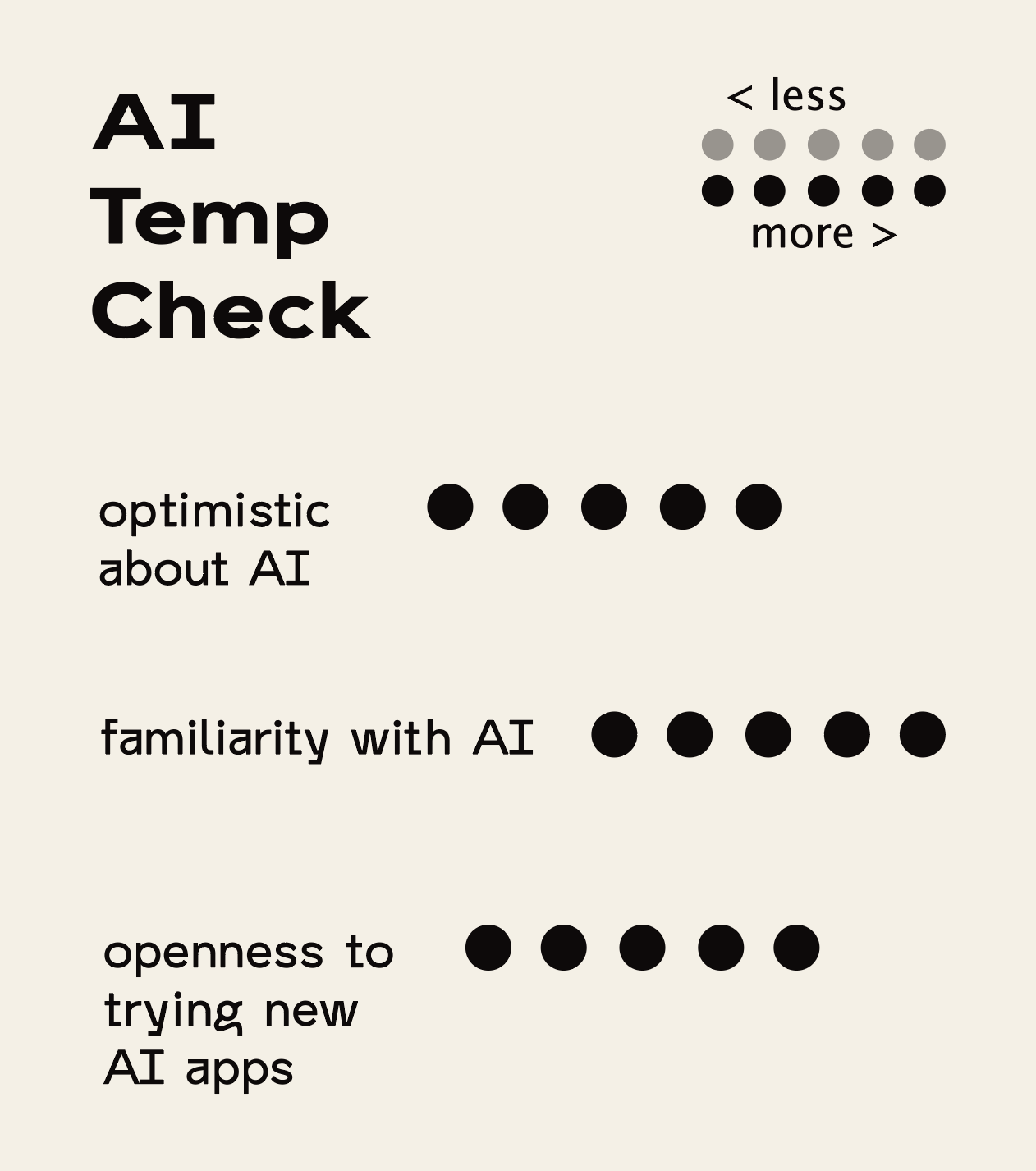
PRIMARY PERSONA — THE FOUNDER
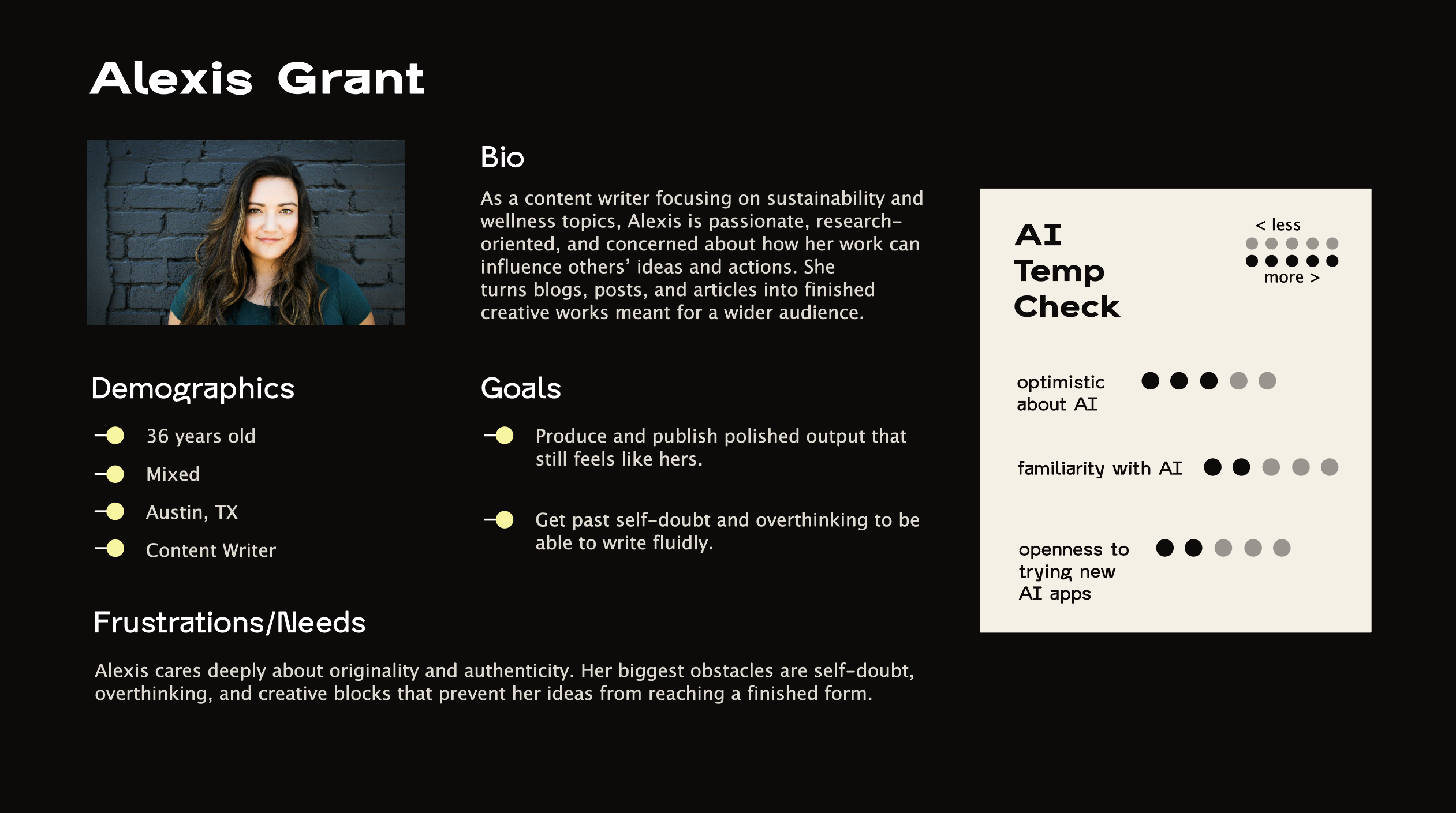
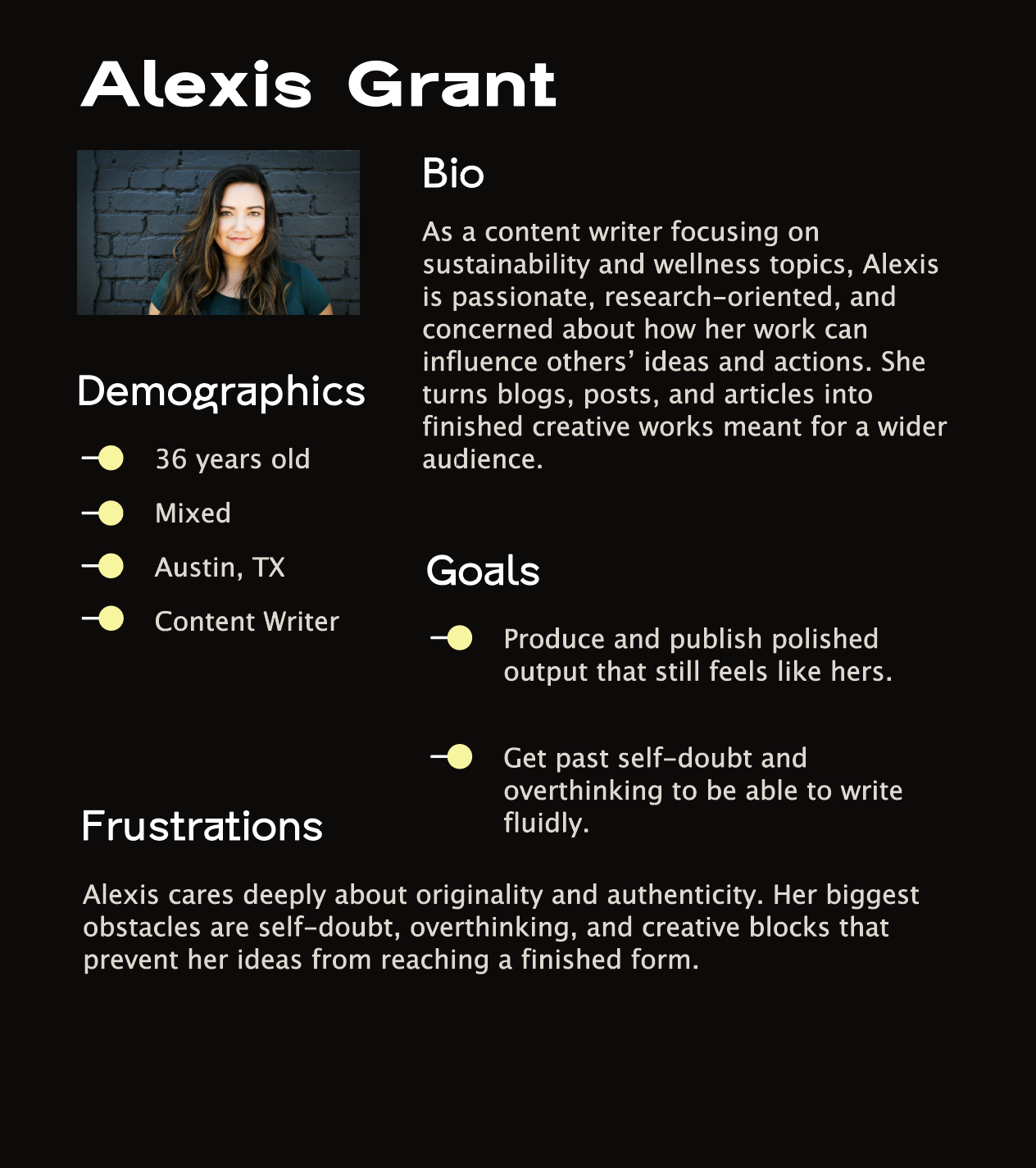
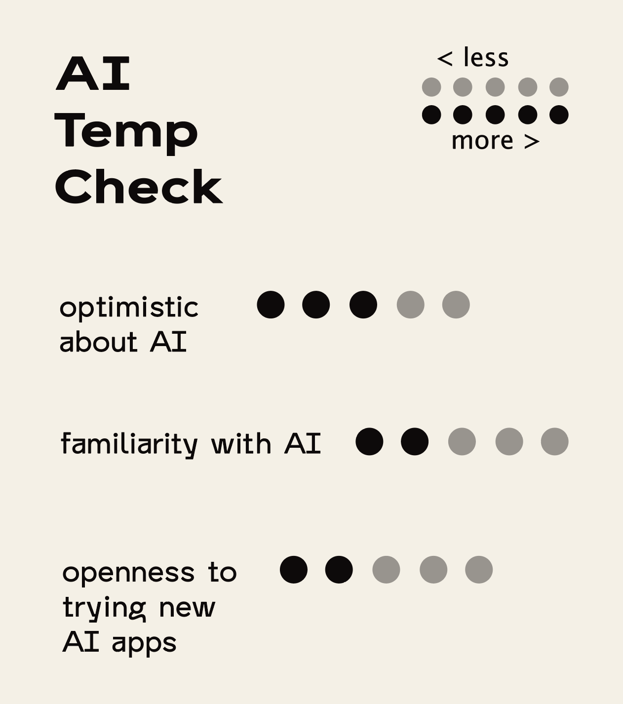
SECONDARY PERSONA — THE CONTENT WRITER
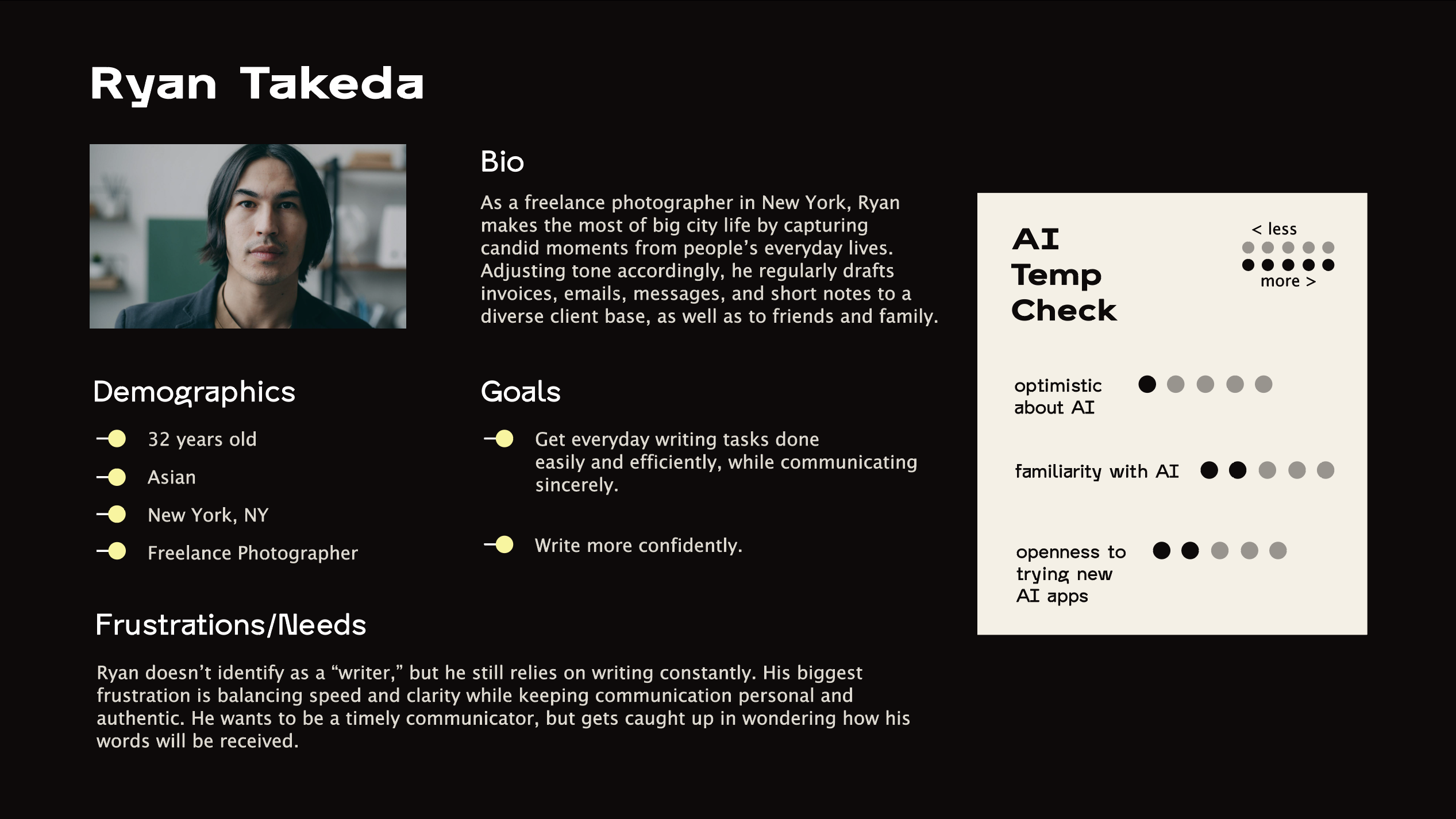
TERTIARY PERSONA — THE GENERALIST
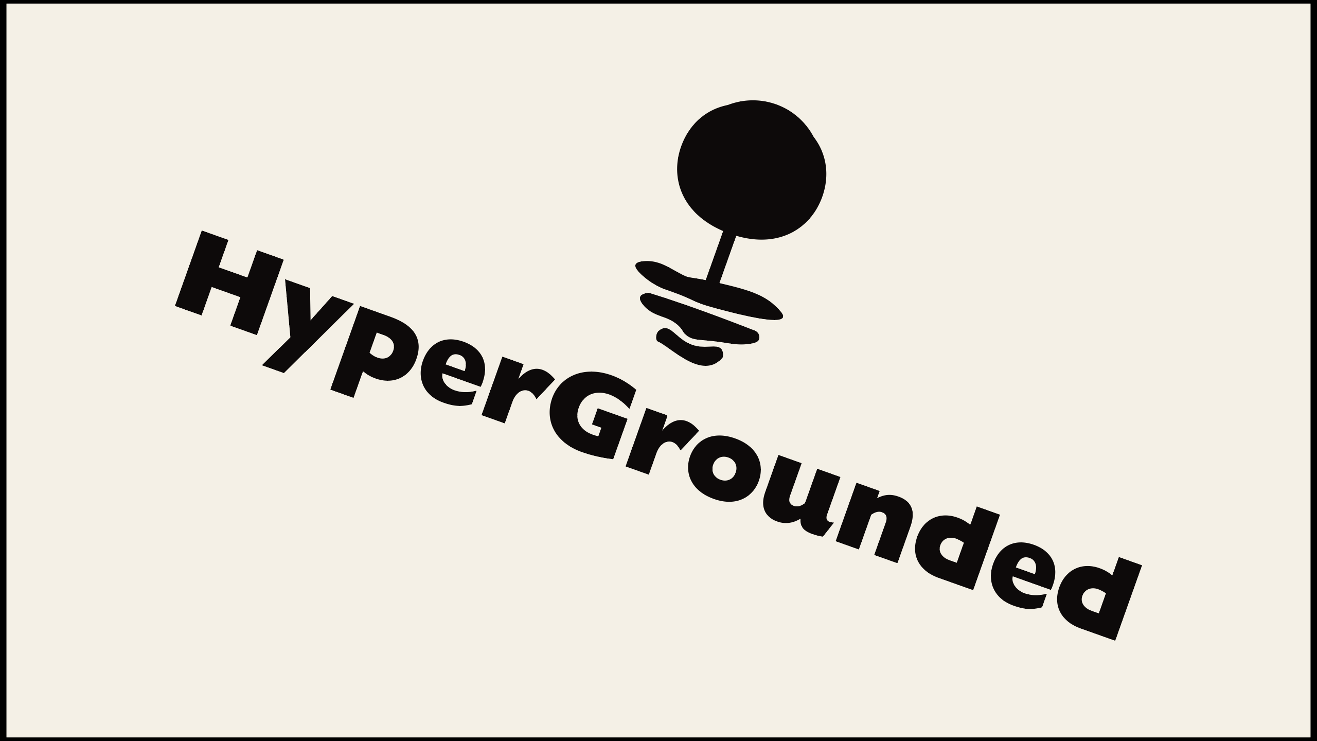
03 Logo
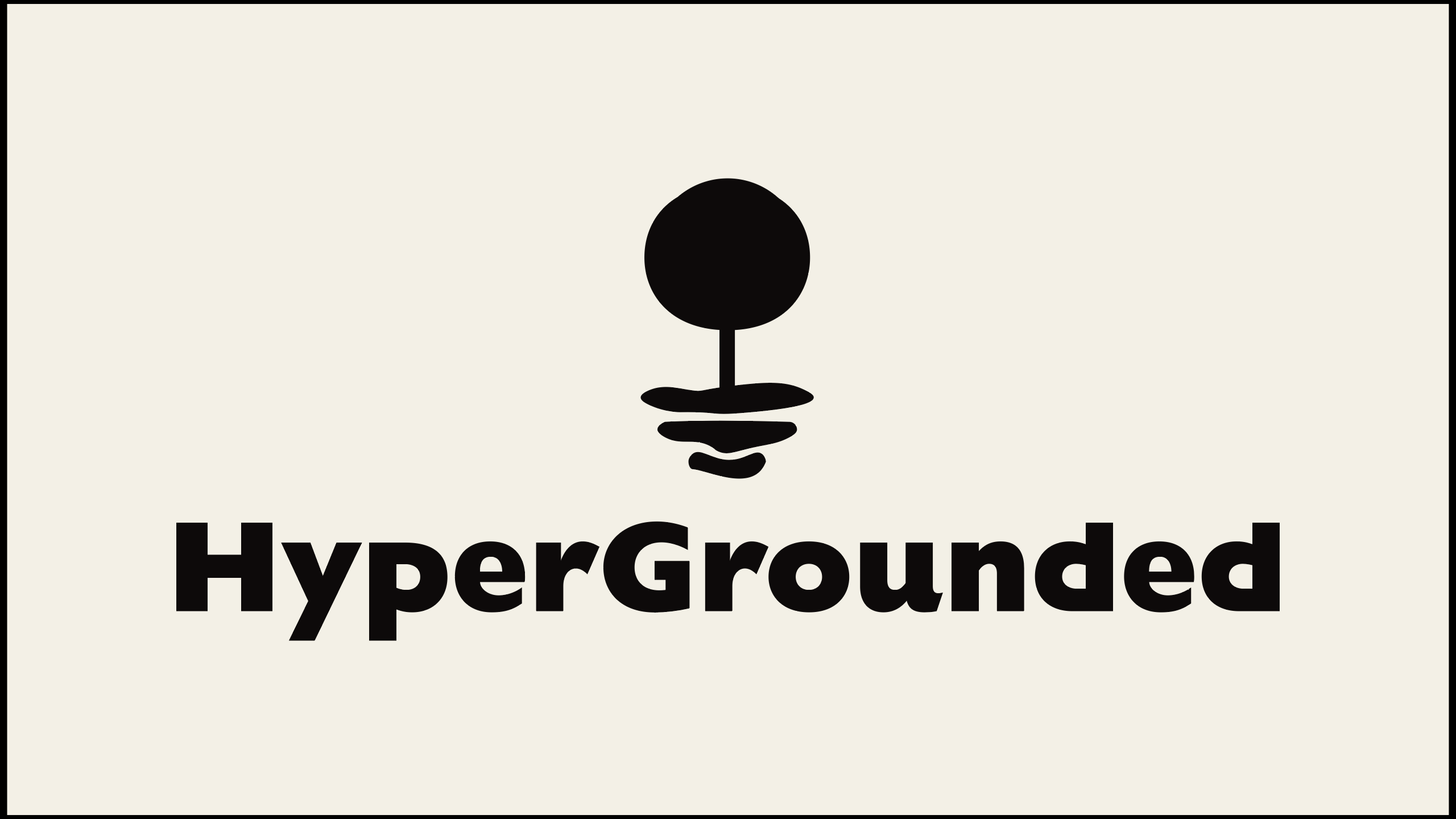
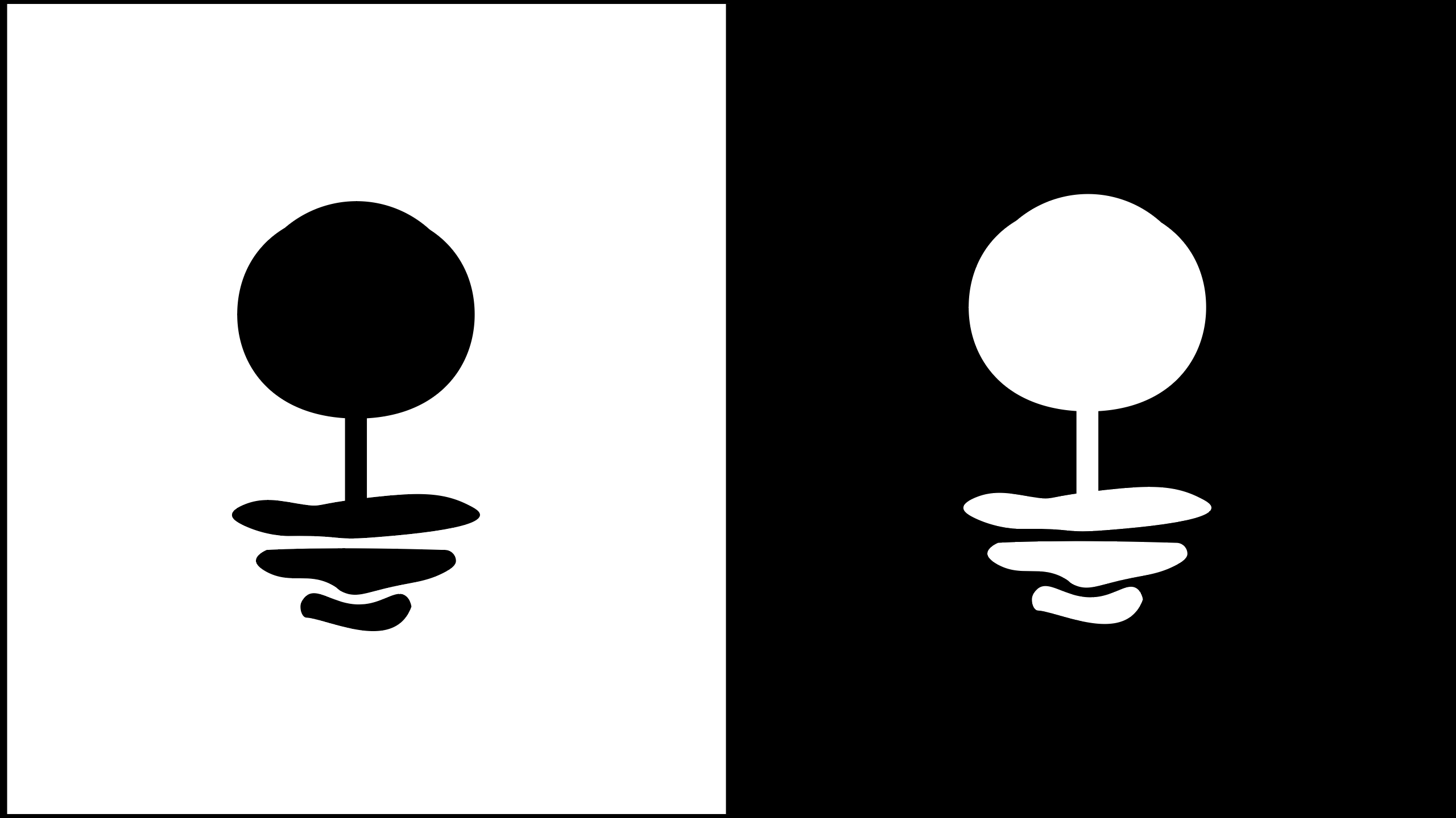
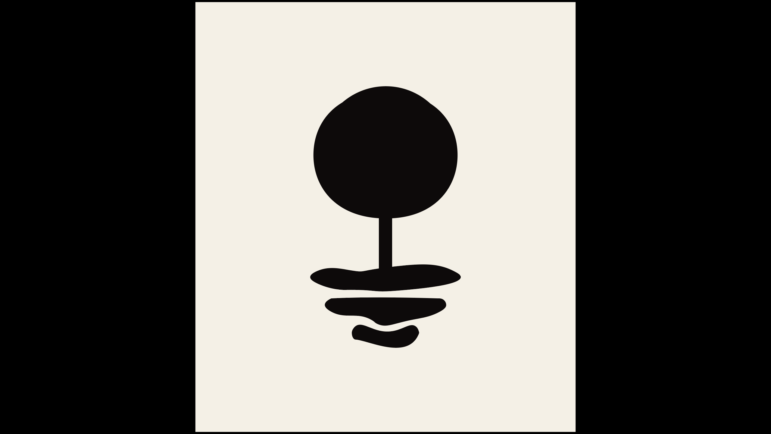
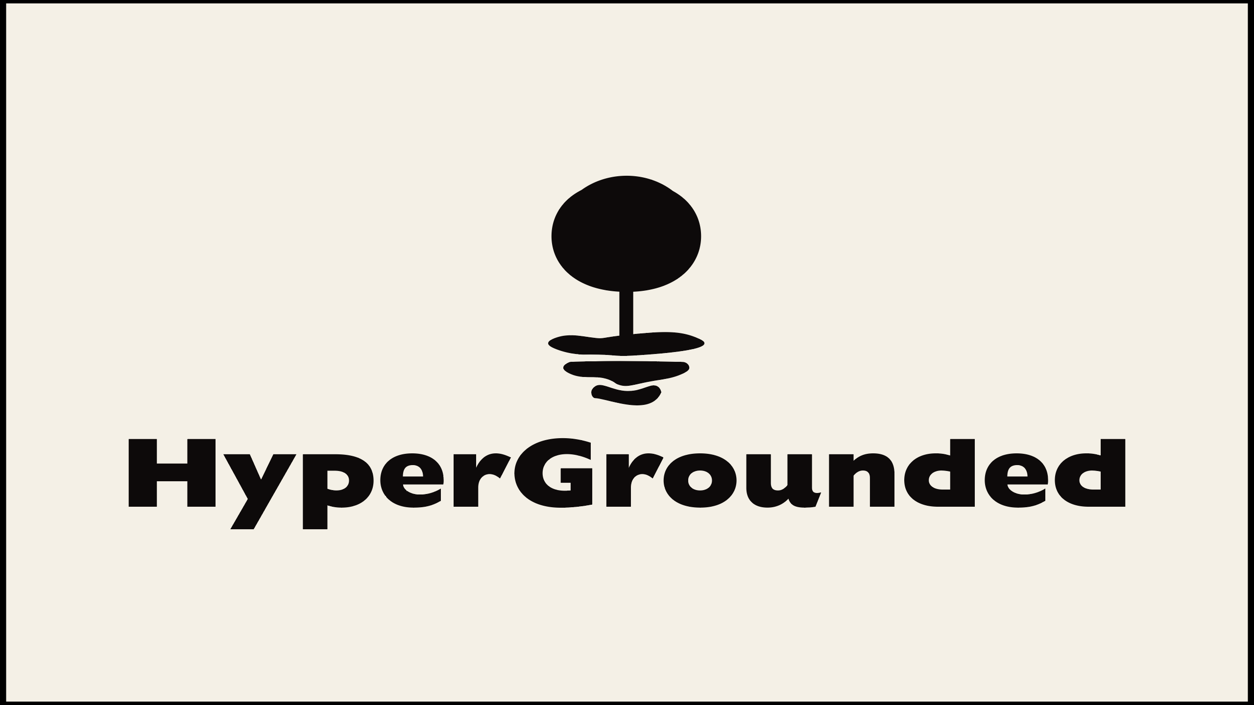
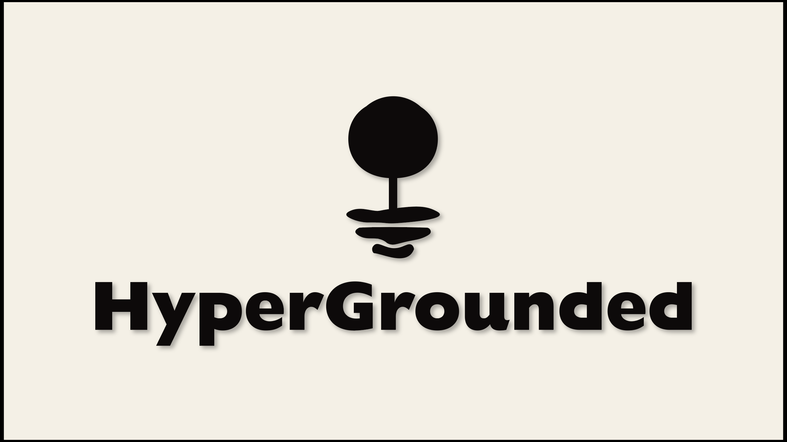
Is it a tree? Is it a rock? Is it something buoyed up by the ocean? Yes! Originating from the universal ‘grounded’ symbol, our logo is a mixture of organic and manmade shapes.
Highlighting this relationship between man and nature portrays a key focus of HyperGrounded: how can we as human beings interact with nature to create something beautifully functional for the benefit of others?
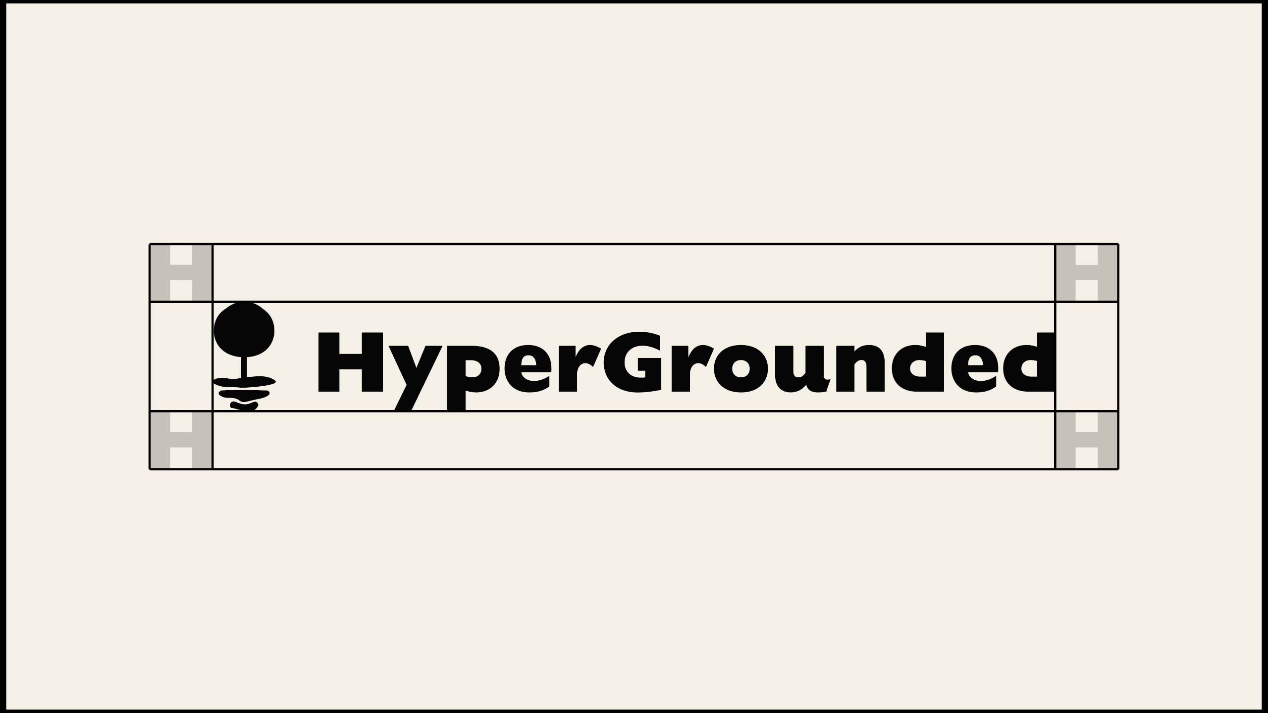
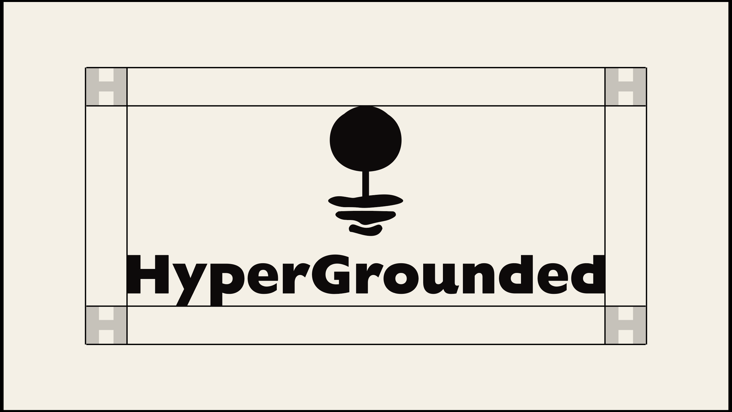
Primary Lockup
Secondary Lockups
Simple
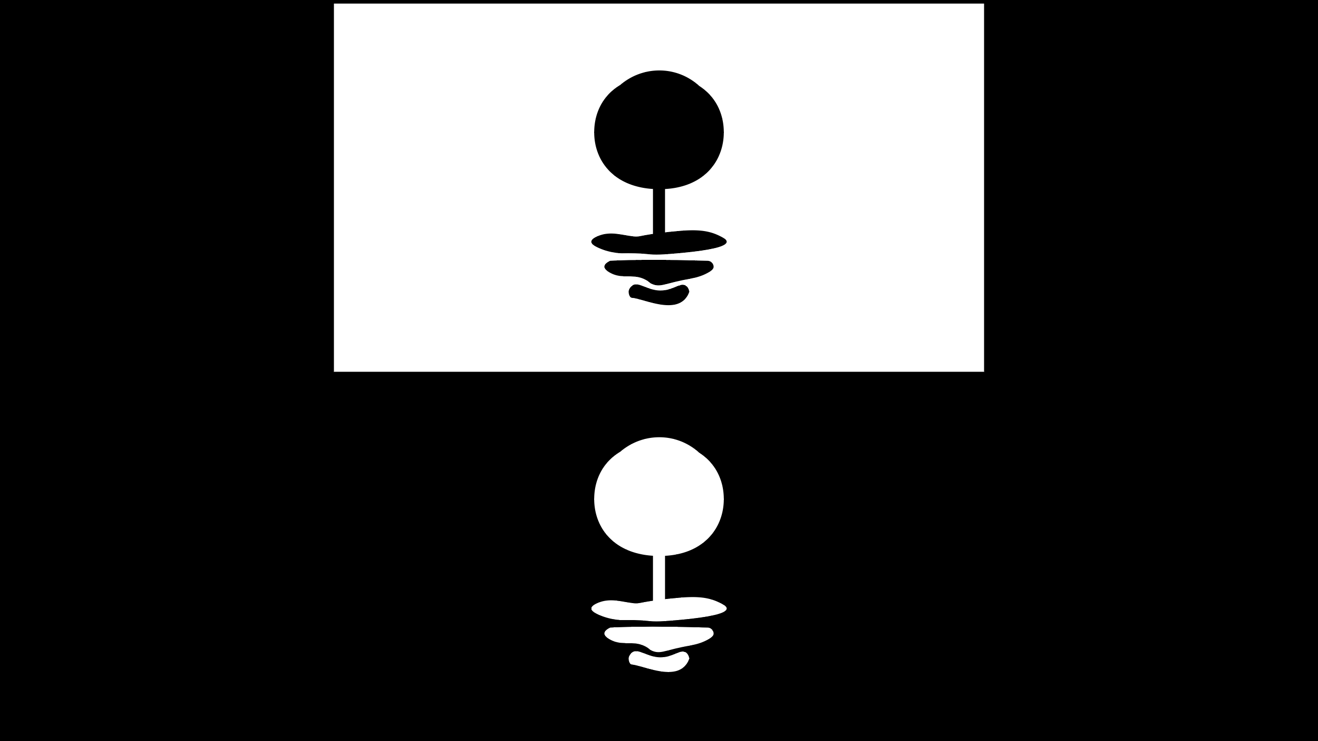
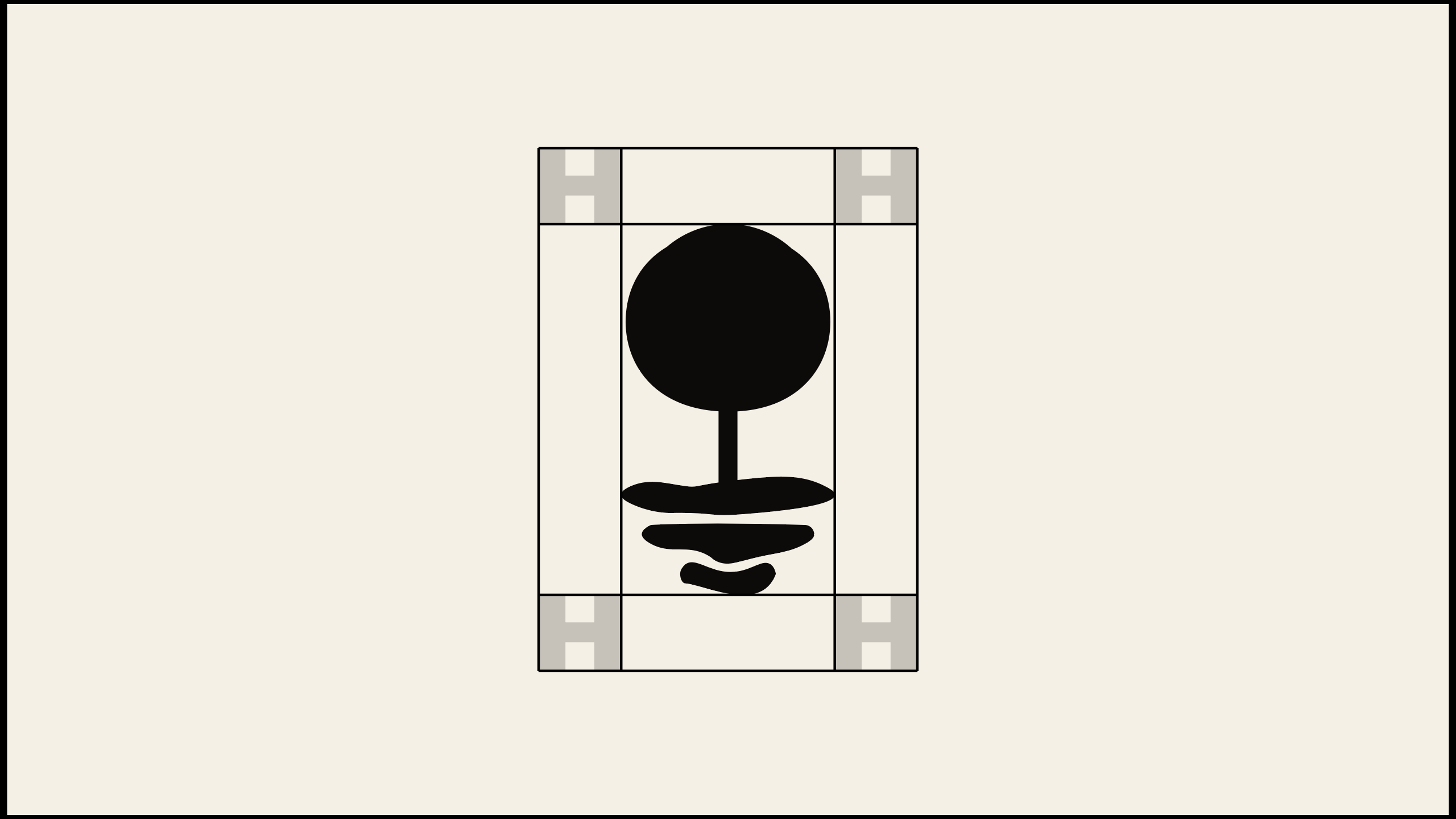
Brandmark
Monochrome
Clearspace
Secondary Lockup
Primary Lockup
Brandmark
Logotype
Incorrect Logo Usage

Do not stretch or skew the logo
Do not rotate the logo
Do not modify spacing
Do not outline the logo
Do not apply secondary colors
Do not apply effects
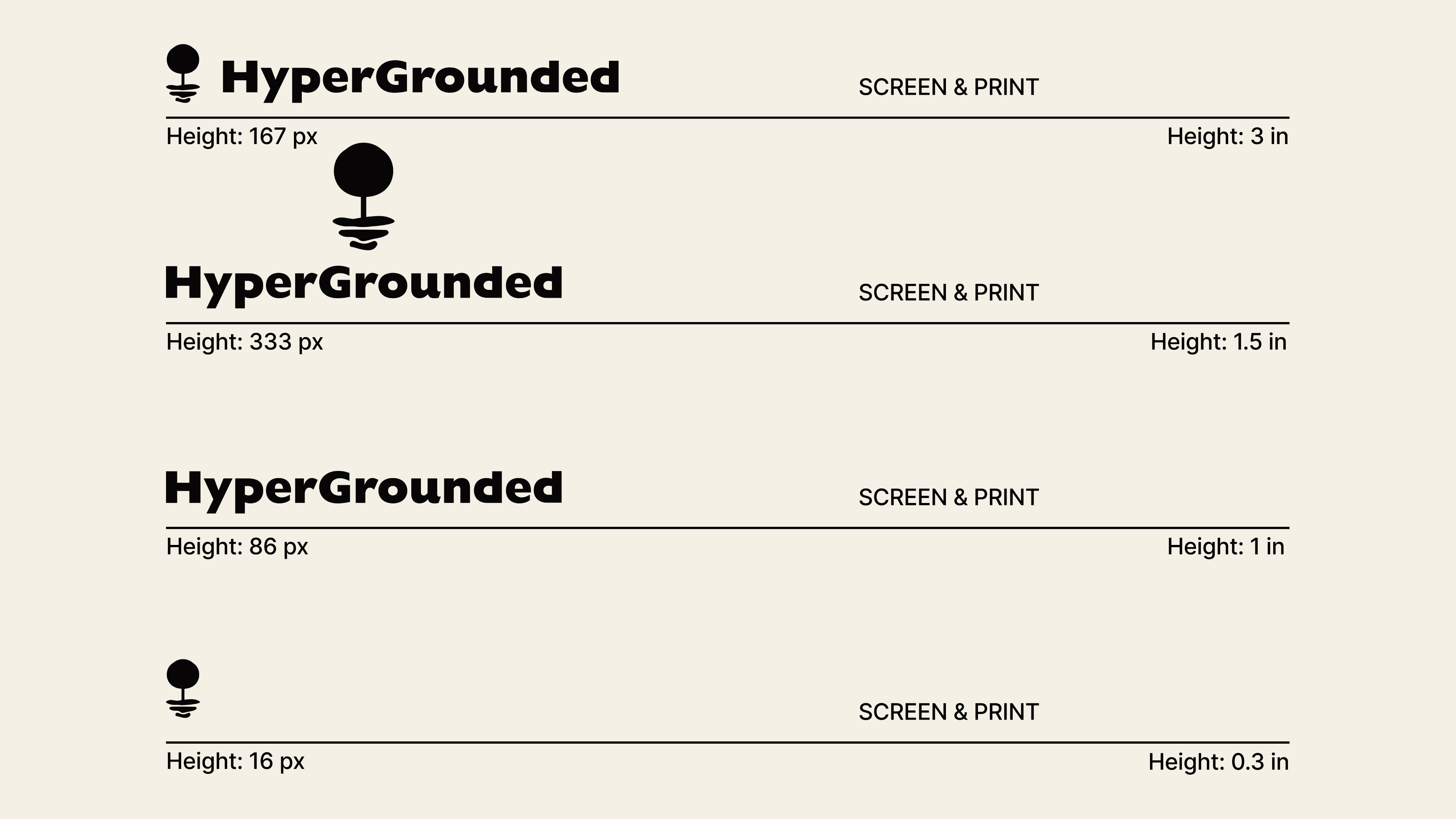
Logo Minimum Size
04 Color
HyperGrounded’s color palette is designed for simplicity and nostalgia, while leveraging high-contrast colors to ensure accessibility. Using such minimal palettes makes it easier to maintain brand consistency across all brand collateral, which helps users get to know and recognize us.
Primary Palette
Lace
RGB: 255, 255, 255
Hex: #FFFFFF
CMYK: 0, 0, 0, 0
Pantone: N/A
Sable
RGB: 13, 9, 10
Hex: #0D090A
CMYK: 6, 8, 5, 98
Pantone: 419 C
Linen
RGB: 244, 240, 229
Hex: #F4F0E5
CMYK: 0, 2, 6, 4
Pantone: N/A
Secondary Palette
Butter
RGB: 247, 247, 151
Hex: #F7F797
CMYK: 2, 0, 45, 0
Pantone: Yellow 0131 C
Good Rules of Thumb
Apply the 70-30 Rule
While using these colors, generally stick to a 70-30 rule, allocating 70% of our Primary Palette and 30% of our Secondary Palette to any given design. As always, prioritize contrast for accessibility.
Use Opacity Over More Colors
When possible, use opacity to modify colors. This allows us to use fewer colors in our palette.
Use Gradients SPAAAARINGLY
Don’t believe the hype: gradients can be nice, but they quickly become trite when overused. That’s why we reserve them for slide decks and to fancify illustrative elements.
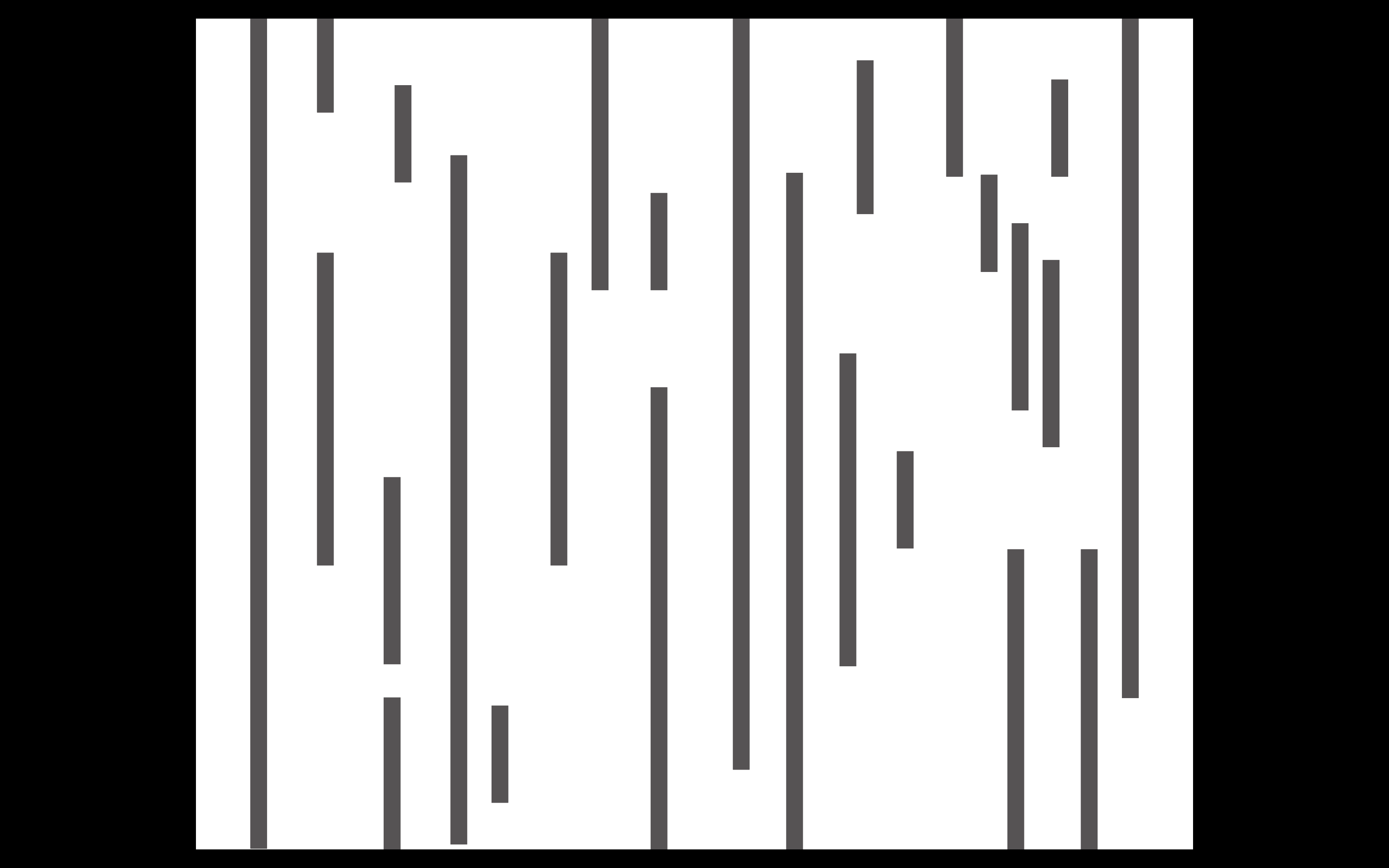
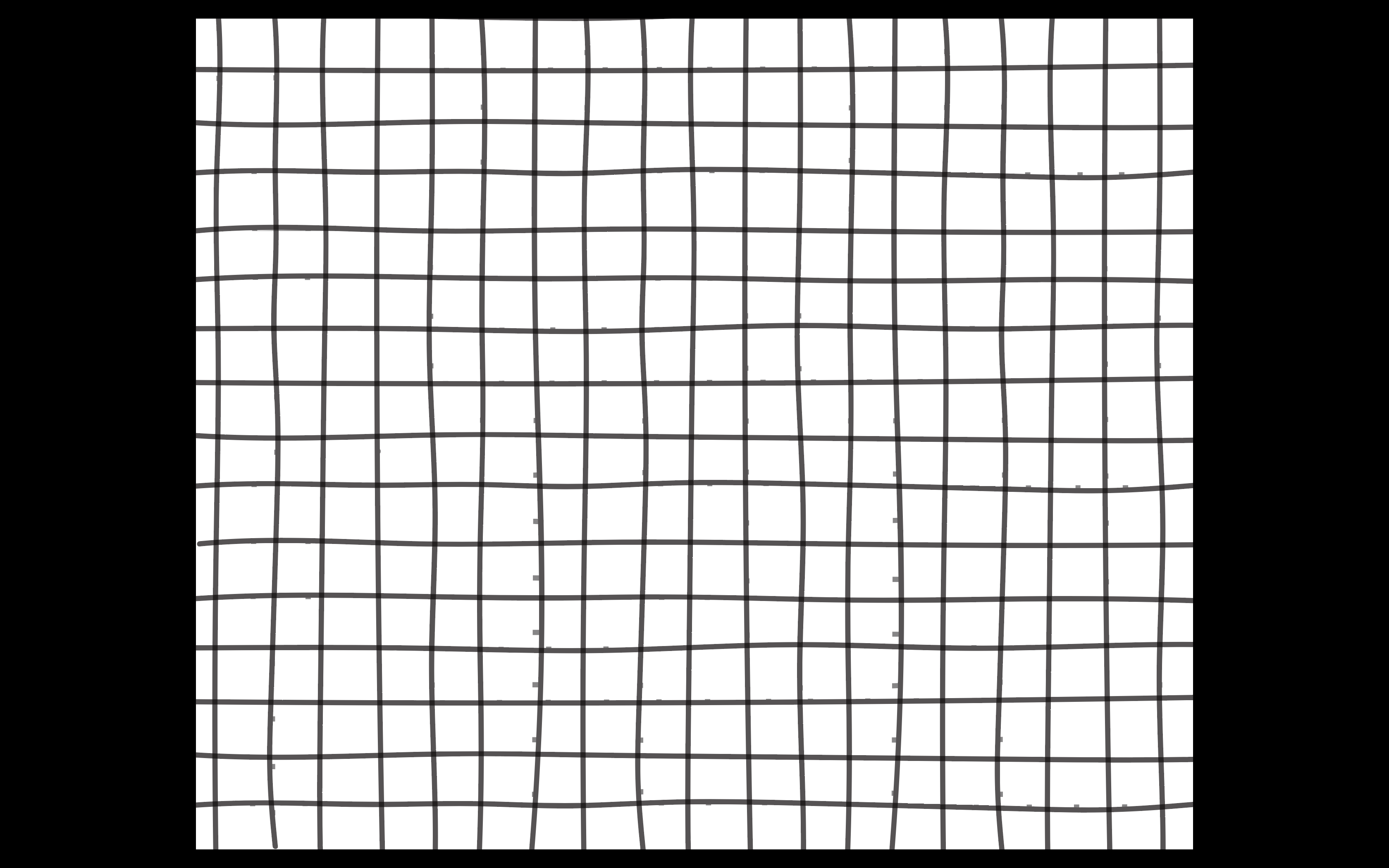
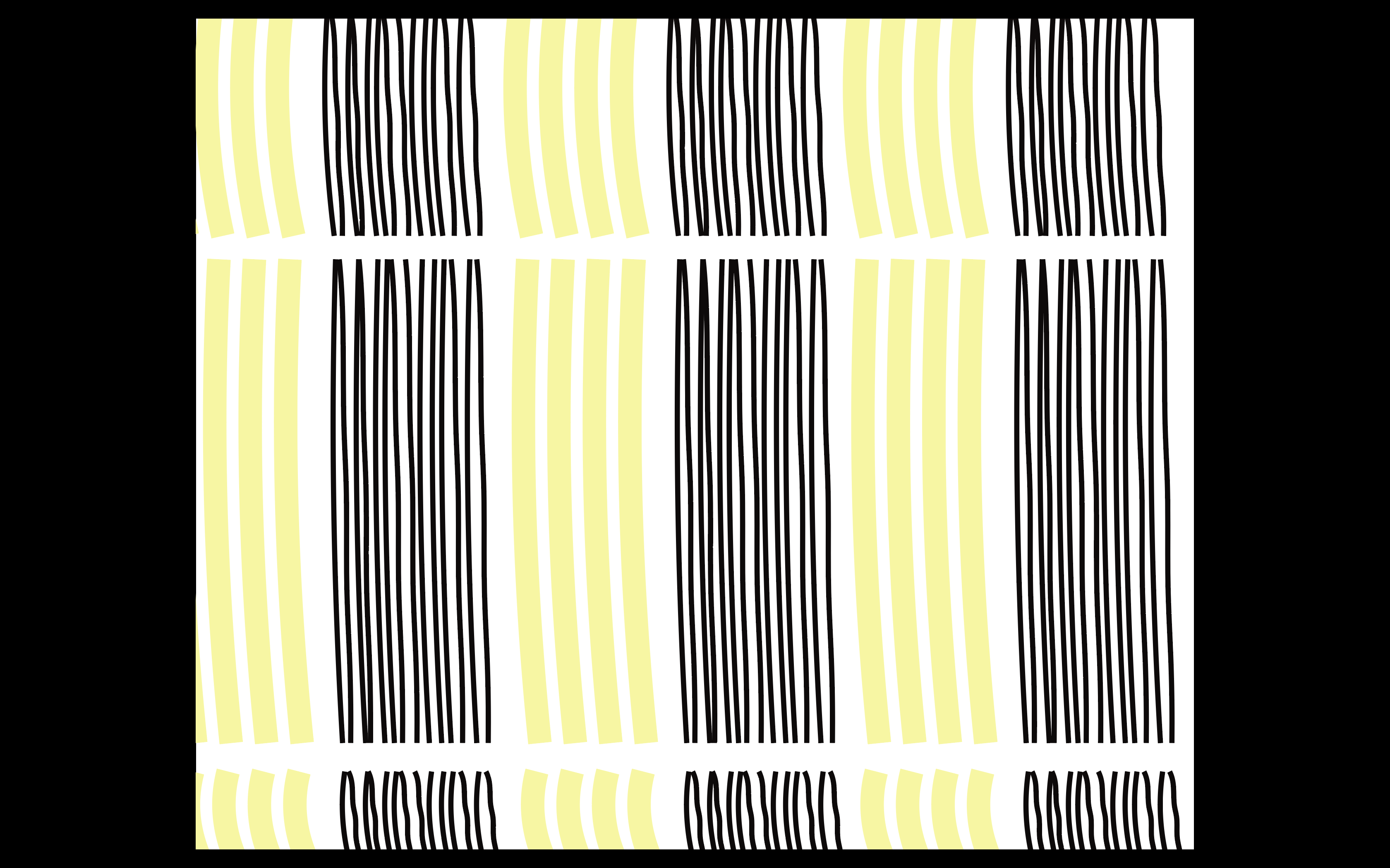
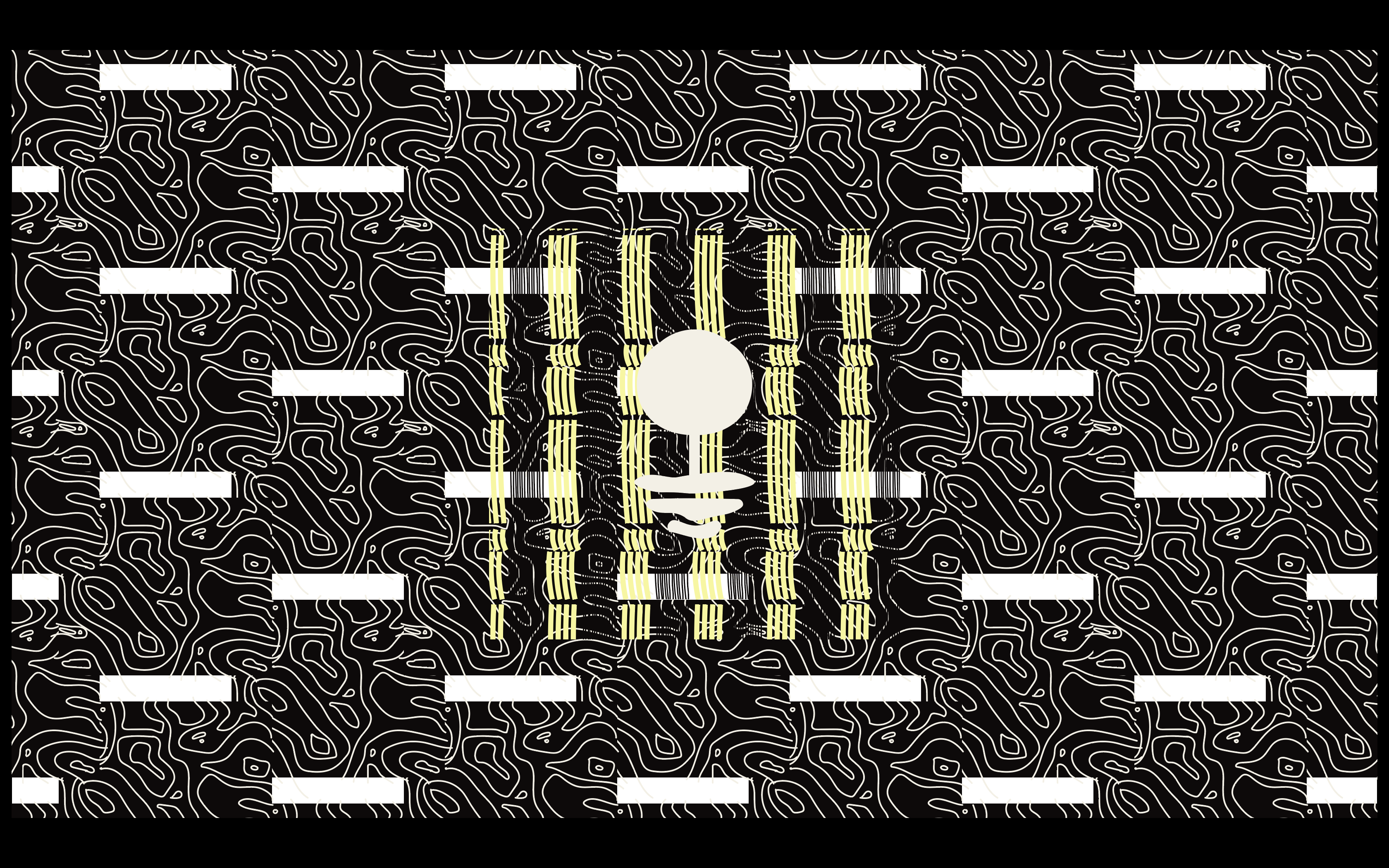
Patterns
Brick
Grid
Wood Grain
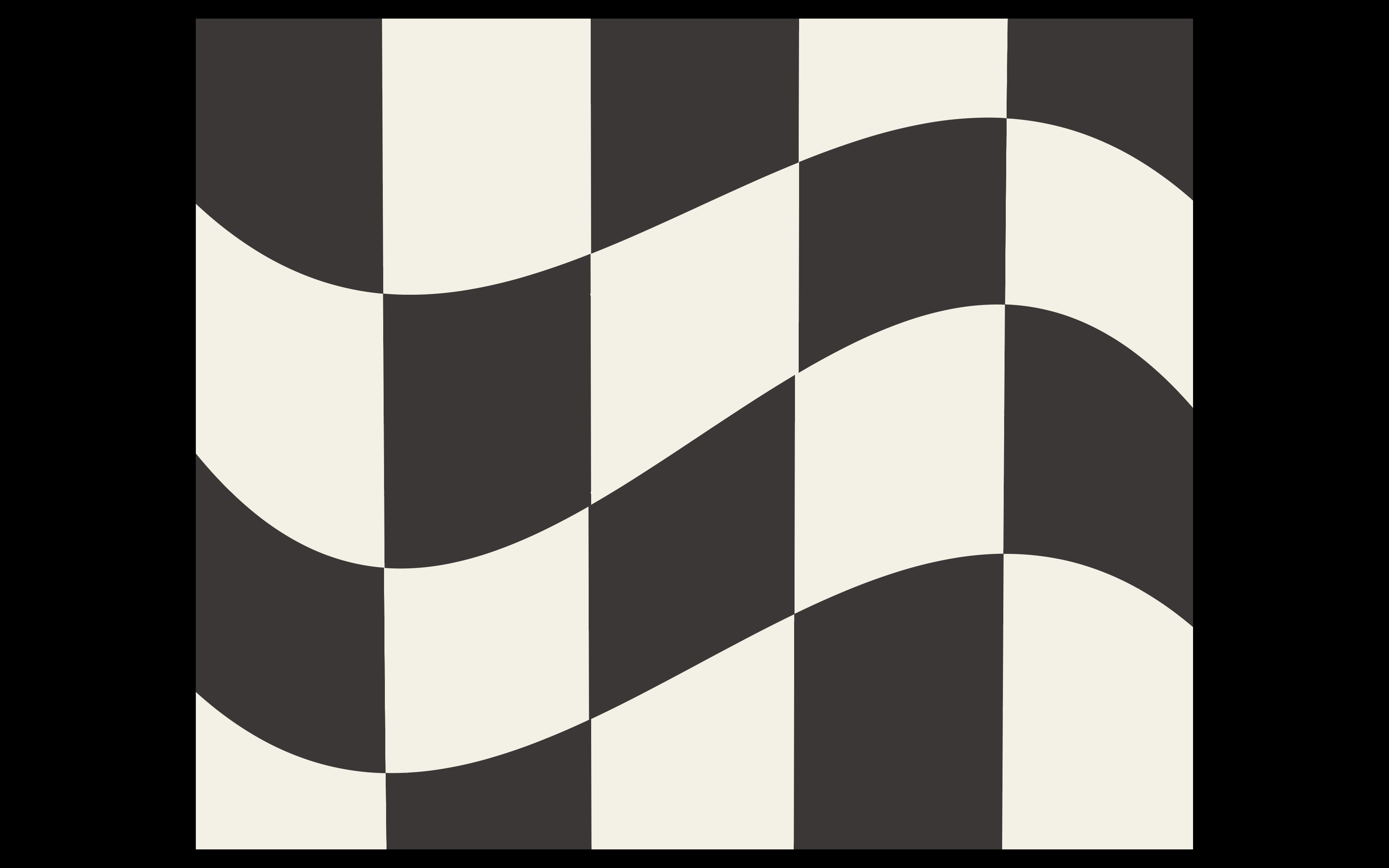
Checker
Slats
Newspaper
Wallpaper
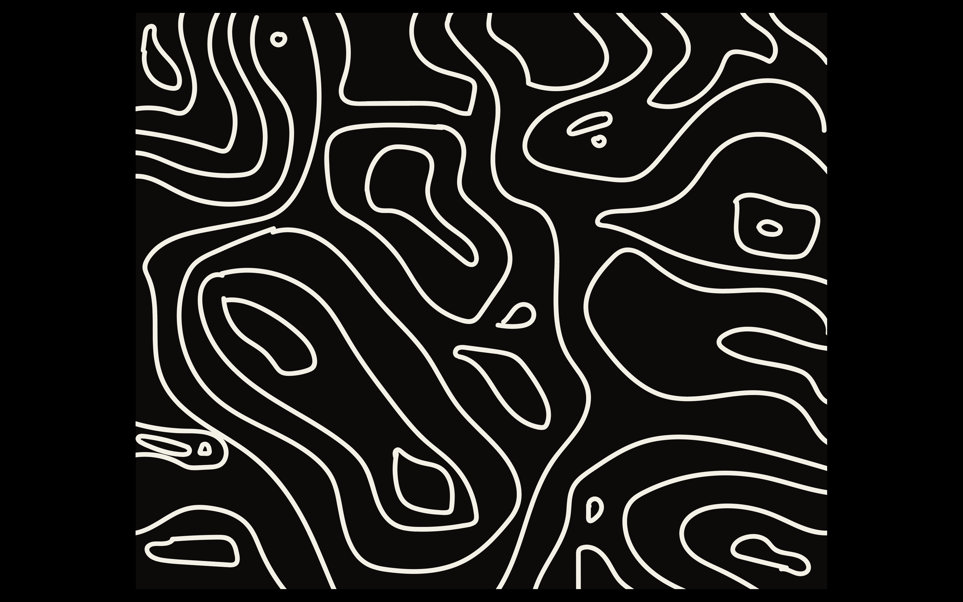
Topography
Gradient Palette

Mist
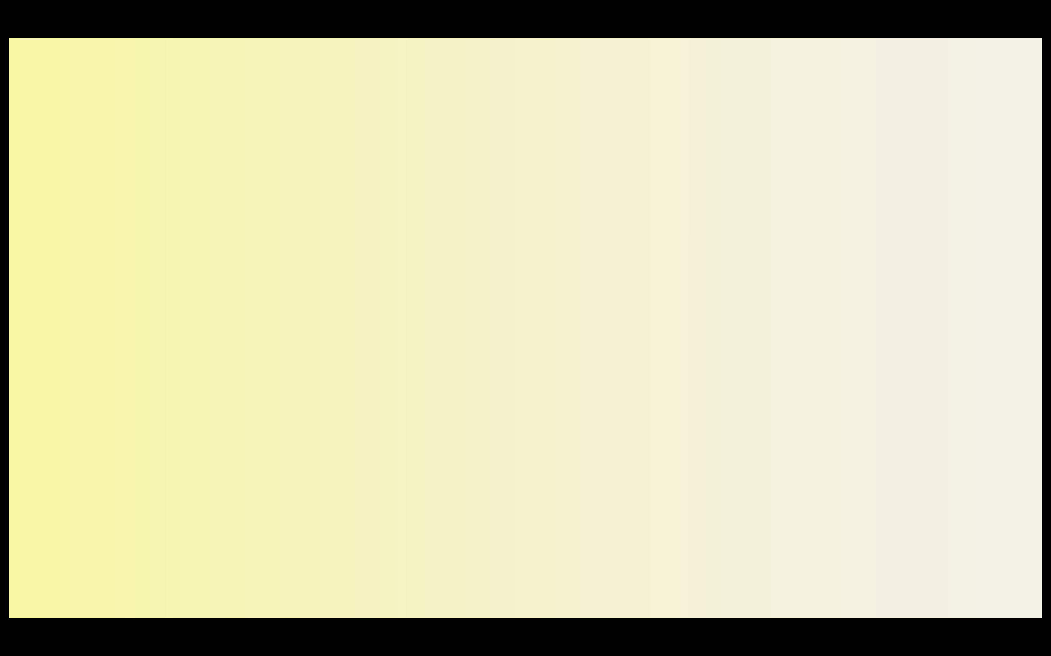
Sunlight

Graphite
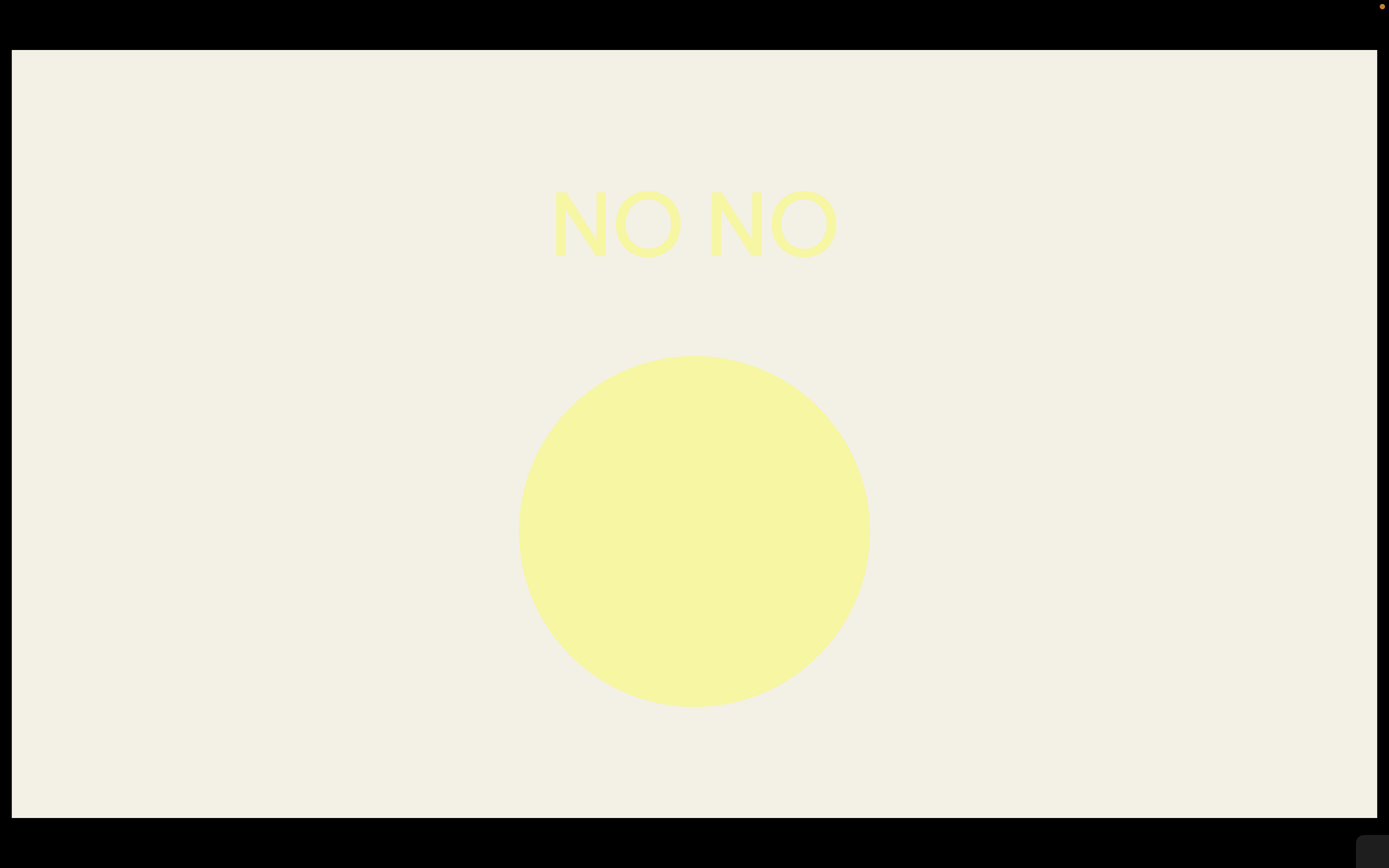
Incorrect Color Usage
Do not use Butter on Linen
Do not use Lace on Butter

Do not use Linen on Lace
Do not ignore 70-30 rule

Do not use non-brand colors
Do not overwhelm
05 Typography
HyperGrounded’s typography is accessible, playful, and a little retro.
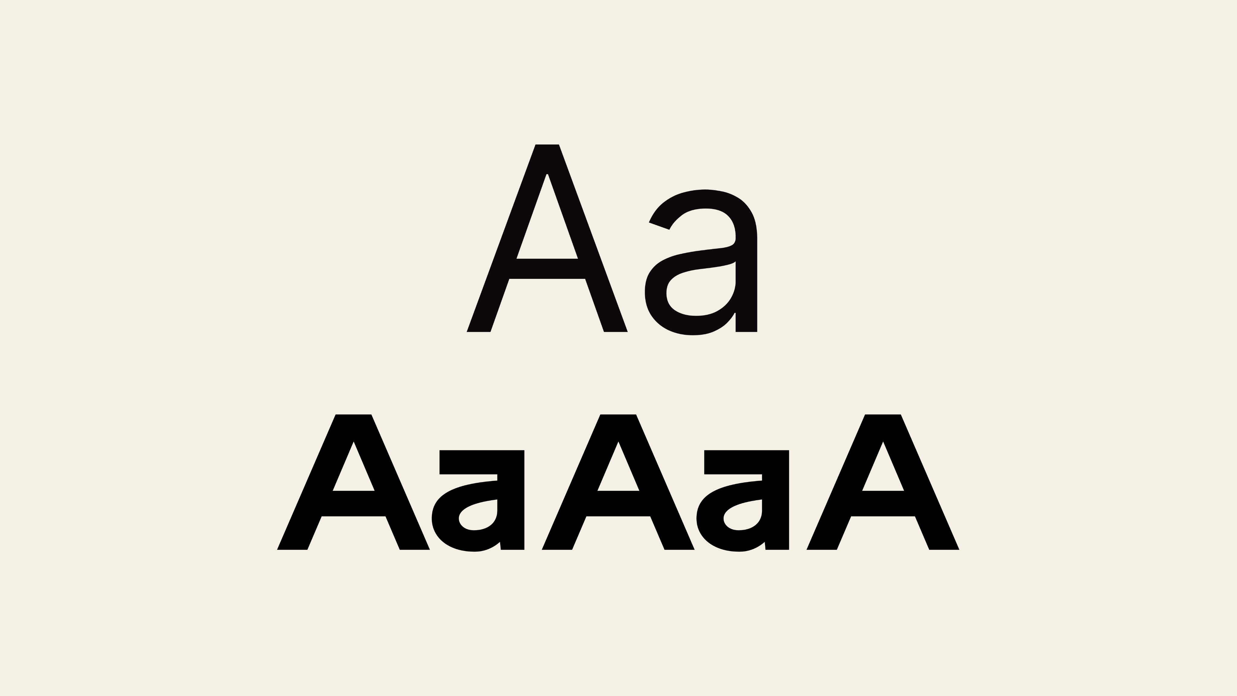
Inter, a Sans-Serif typeface, is highly legible, widely available, and compliments our secondary typeface well. We use Inter for all body text, captions, links, and small display text.
Sans-Serif typeface Archiv Grotesk is where HyperGrounded’s playful nature shines and our love of the analogue realm is made apparent through the fonts retro style. Use this for headers, menus, and creative designs.
Our tertiary typeface, Lucida, is only to be used as a substitute for Inter when software cannot render fonts correctly (ex. recipients client email, browser, or device doesn’t have the font, thus defaulting to its own selection). We can get ahead of this by pre-selecting a default or by designing for email campaigns in this font from the start.
Primary Typeface
Inter
Secondary Typeface
Archiv Grotesk
Tertiary Typeface
Lucida
Sizing
When deciding on text sizes for digital and print media use 1.618—the golden ratio—to divide or multiply text sizes and round to the nearest number. This can help create clear information hierarchy while maintaining pleasing proportions.
Heading 1
Ancient Alien Technology Found In Dumpster
Archiv Grotesk Bold
110% Leading
-1% Tracking
Heading 2
Ancient Alien Technology Found In Dumpster
Archiv Grotesk Bold
120% Leading
-2% Tracking
Heading 3
Ancient Alien Technology Found In Dumpster
Archiv Grotesk SemiBold
120% Leading
-1% Tracking
Paragraph Bold
Scientists discovered ancient platelet technology that was causing dumpster fires all across the Chicago downtown area Sunday night.
Inter Bold
120% Leading
-1% Tracking
Paragraph
Scientists discovered ancient platelet technology that was causing dumpster fires all across the Chicago downtown area Sunday night.
Inter Medium
120% Leading
-1% Tracking
Caption 1
Image of alien clothes left behind with platelet technological device.
Inter Medium
120% Leading
-1% Tracking
Caption 2
Image of alien clothes left behind with platelet technological device.
Inter Medium
120% Leading
-1% Tracking
Links
Menu item
Inter Medium
120% Leading
-2% Tracking
Display
Copyright 2025 HyperGrounded Inc.
Inter Medium
120% Leading
-2% Tracking
06 Art
Direction
Here at HyperGrounded our art reflects moments from people’s everyday lives. Themes of emotion, nostalgia, the interaction between humans and nature, appreciation for fleeting moments, and the subjective view (ex. photographer’s eye) play a key role in our photography. The following are examples of how we capture these moments.
Our illustrations reflect these themes as well. We make use of isometric design principles, minimalism, and the marriage of digital with analogue art to convey our value for the little things in life that spark joy when we live in an integrated way.
Photography
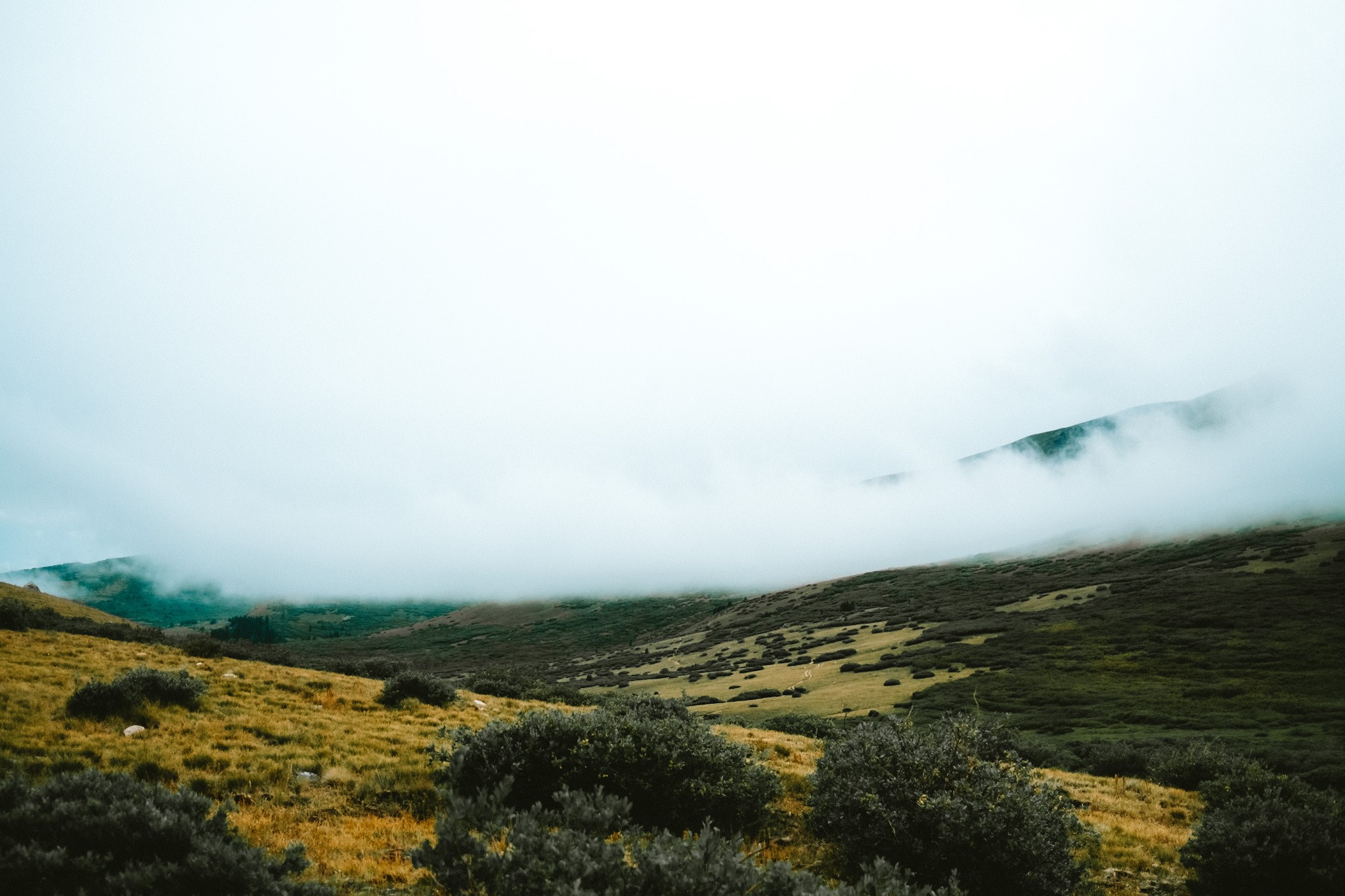
Landscape
This scene is so grand in reality that it stirs emotion in the viewer. Any landscape photography we use should capture this moment, where we feel small, grateful, and awed.
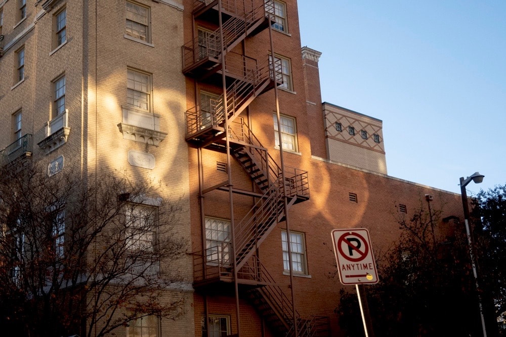
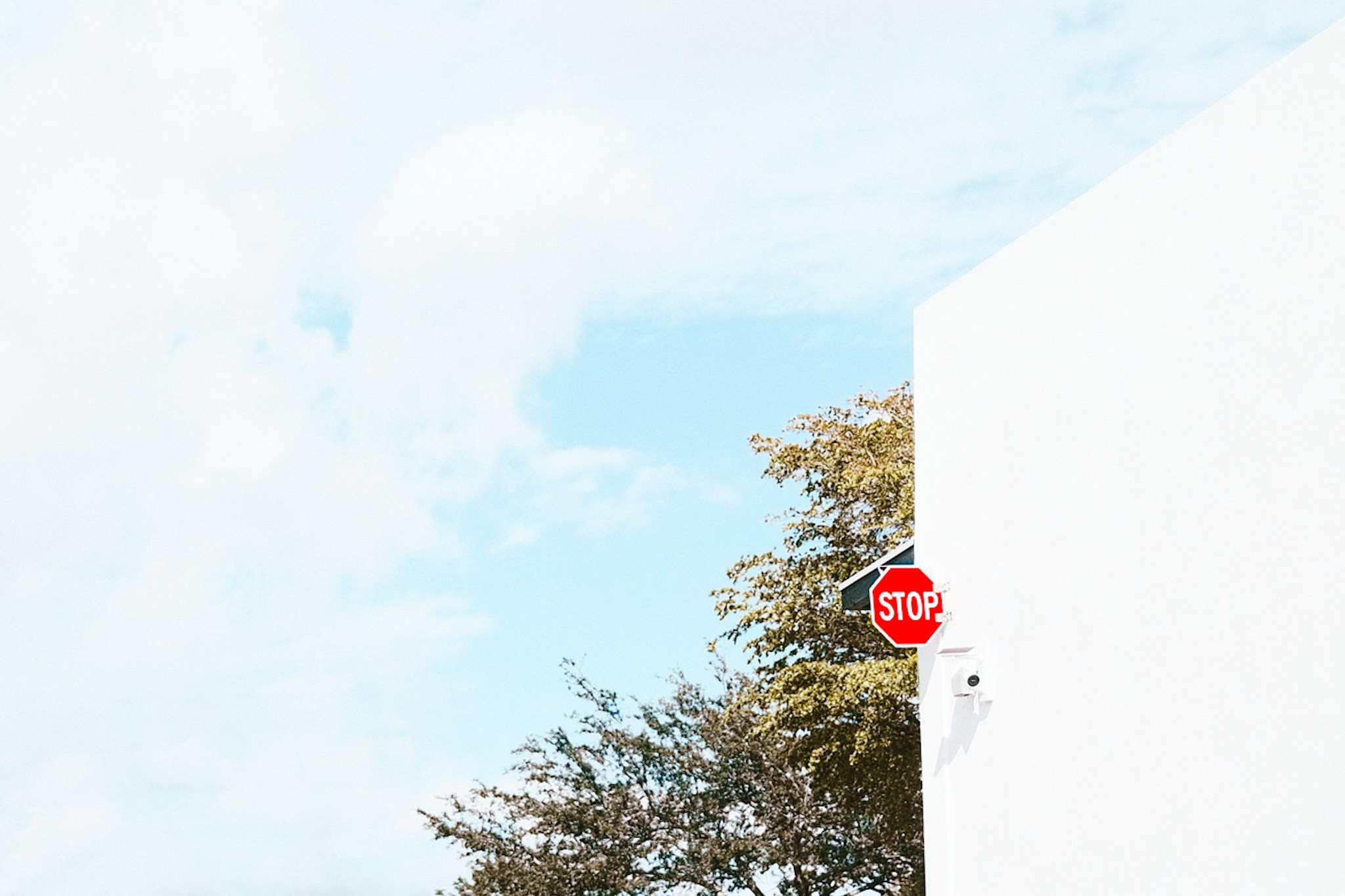
Nature’s Interaction with Humanity’s Creations
We display playful interactions between nature and manmade items.
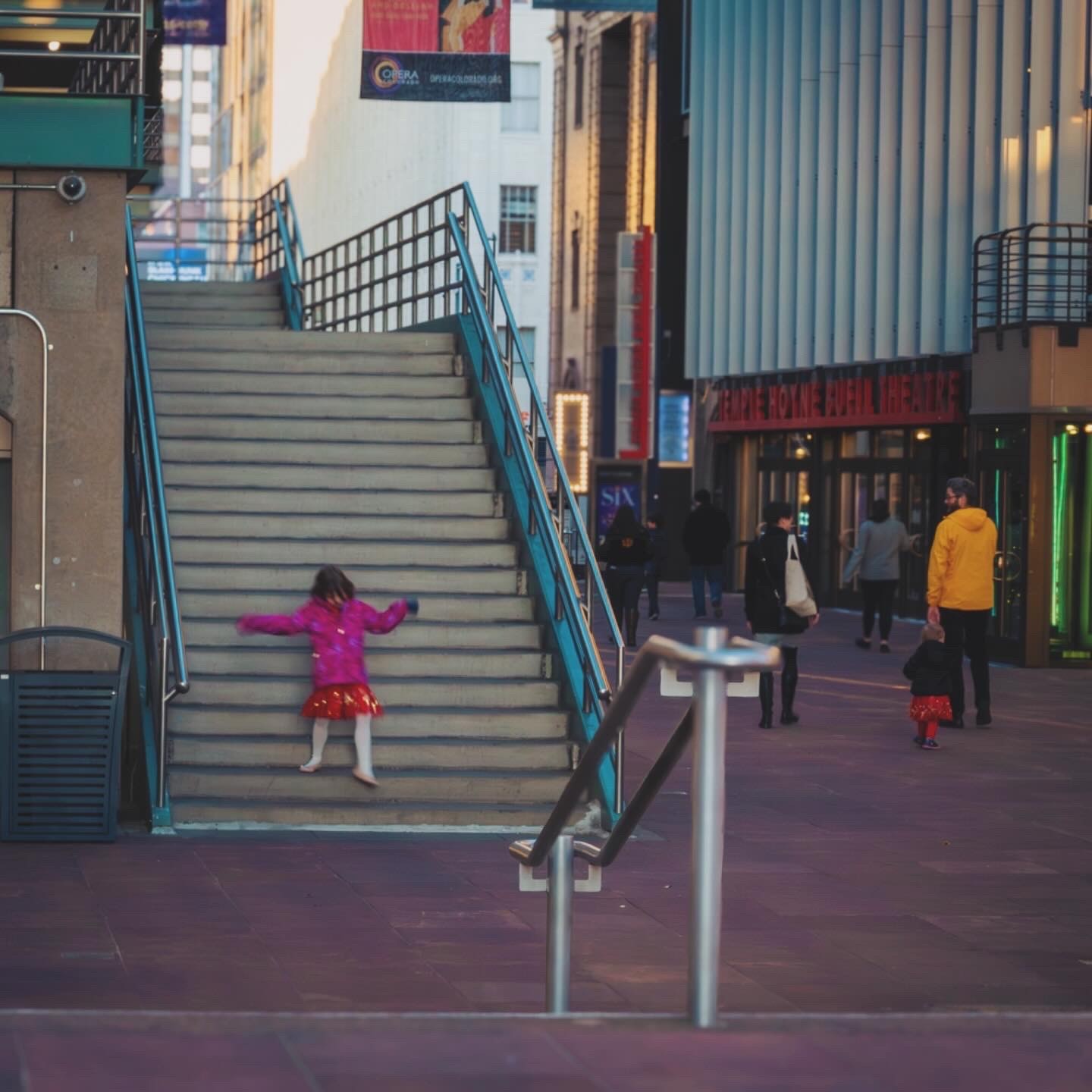
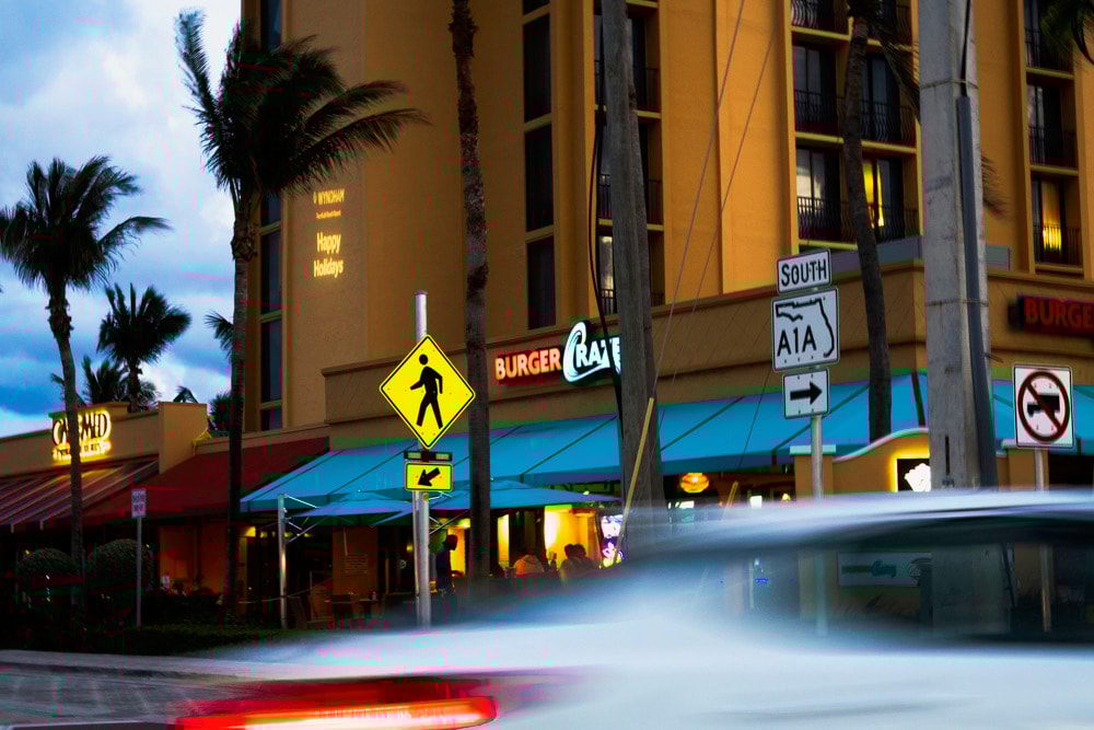
Street
We tell human stories by capturing candid moments.
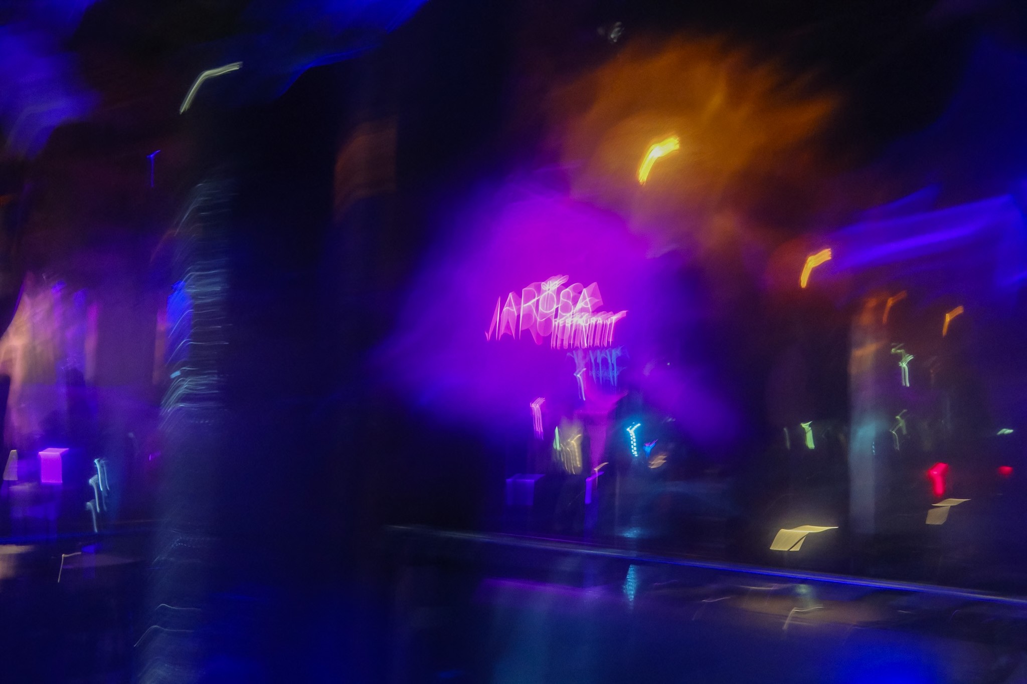
Vibey
We express moods and explore textures.
Minimalistic
We explore moments of simplicity, leveraging images like this for text and graphics.
Photographer’s Eye
We’re interested in imagery that transports people through the photographer’s eye.
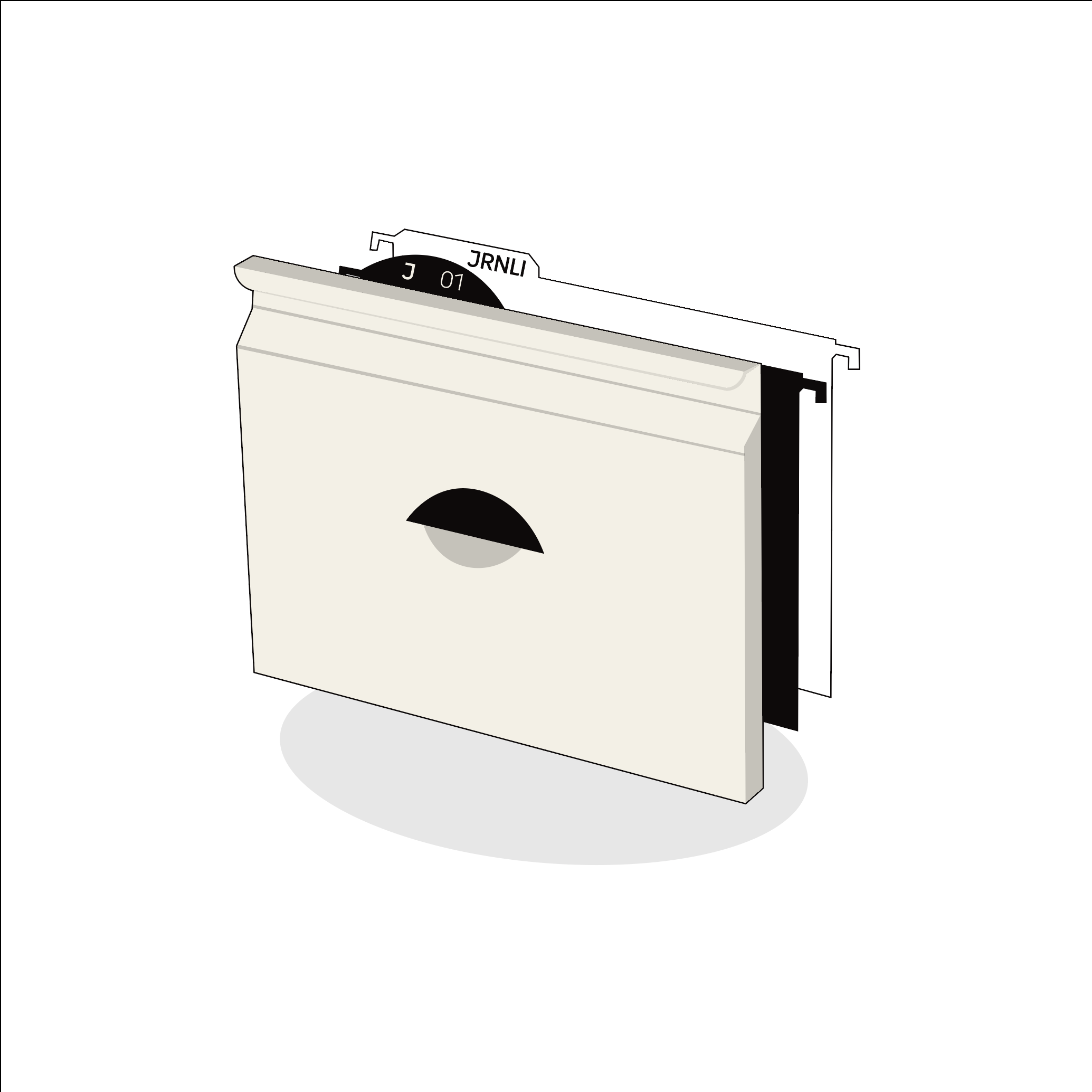
Illustration
Cabinet of Products
We allude to analogue through digital designs.
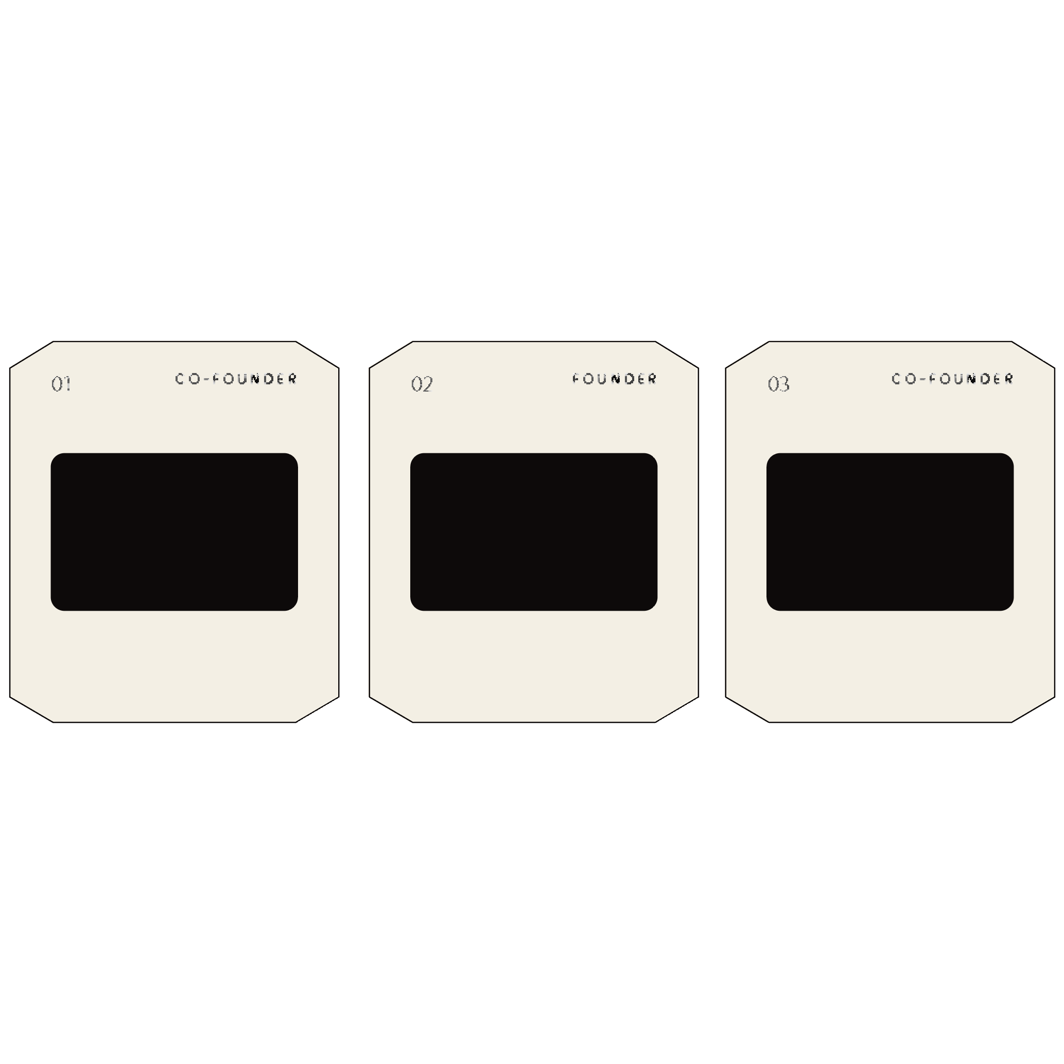
Photo Cards
We use 1 pt. line work.